

Choosing the perfect paint colour for your home can be both exciting and overwhelming.
As a paint colour consultant and decorator, and as the owner of a Home Hardware store with a BeautiTone paint department, I’ve seen firsthand how stressed and overwhelmed people get when making this decision.
They worry about choosing the wrong colour, living with an unappealing choice, or wasting money on more paint.
And yet so many homeowners rush the process, not giving themselves the time this important decision warrants.
To help you avoid these common pitfalls and confidently select a paint colour you’ll love for years to come, you need to be aware of the three biggest mistakes people make when choosing a paint colour.
Mistake #1: Rushing the Decision
One of the most common mistakes I see people make is RUSHING the decision.
I’m shocked that often, people come into the paint store determined to paint that same day (the horror!) because they have the time, it’s the weekend, or the painter is scheduled to arrive the next day. And I can guarantee you that this hurried approach rarely leads to a satisfying result.
Choosing the right paint colour can be TRANSFORMATIVE and so it deserves careful consideration and deliberate decision-making.
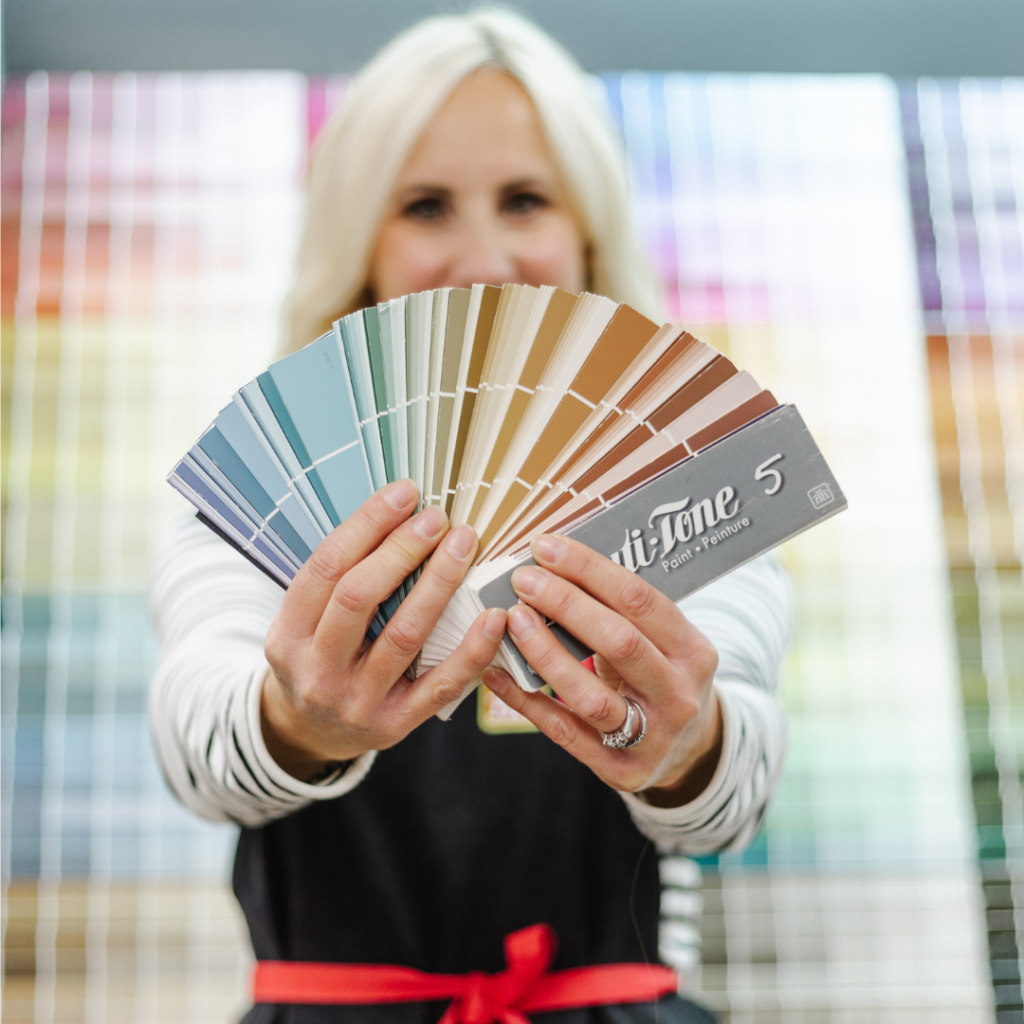
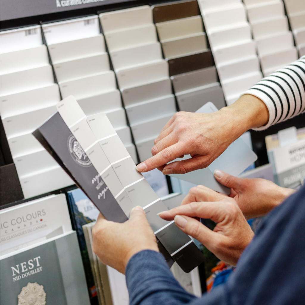
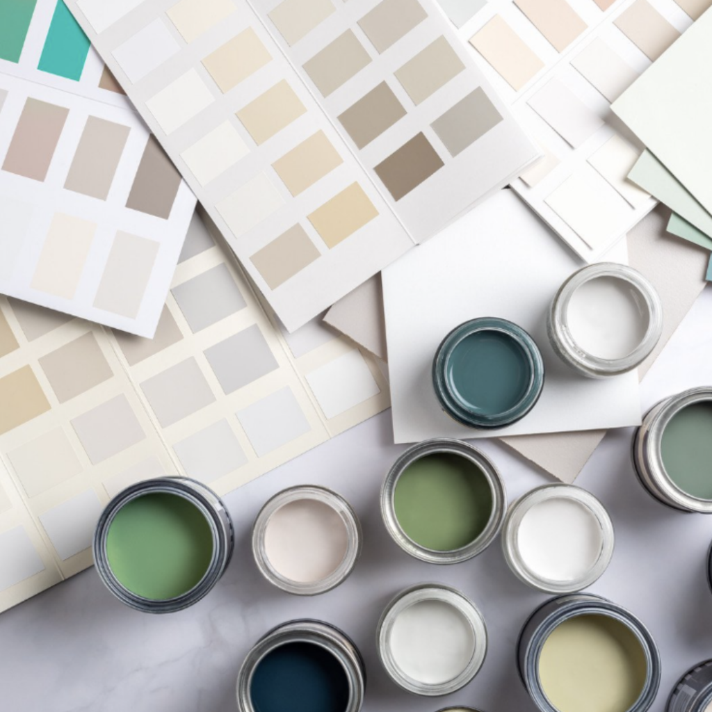
Instead of making a snap decision in the store, set aside at least a week to choose your paint colour. Start by picking your top 10 or 12 colour options from paint chips, then narrow it down through some online research and Pinterest searches.
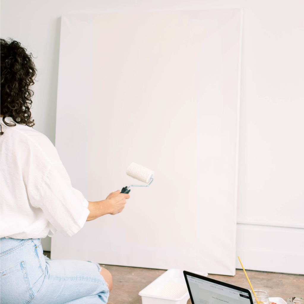
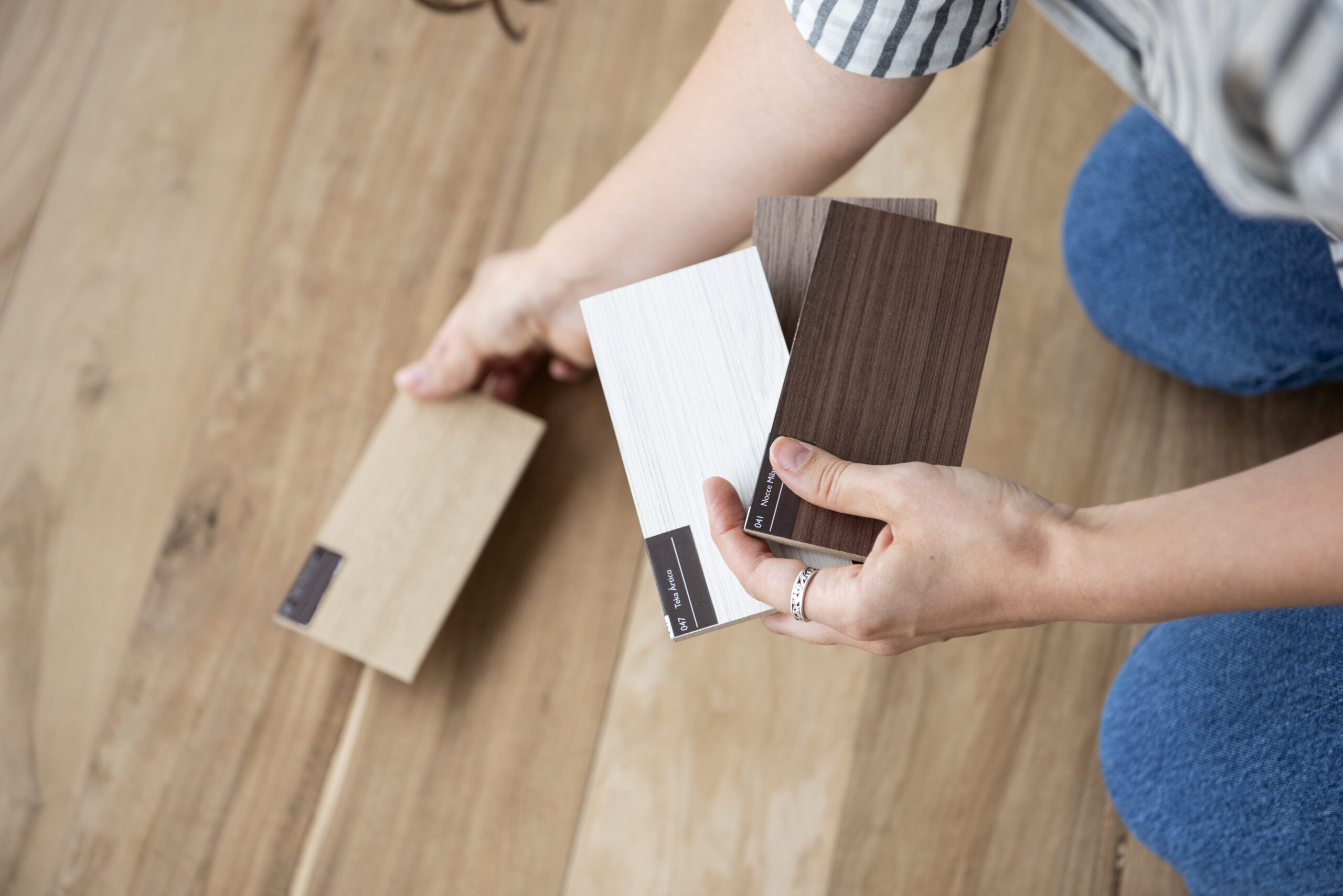
Most importantly, create LARGE colour boards using sample size paint cans that most paint stores sell. Paint these samples onto bristol boards, and observe these colours in your space at different times of the day and against various fixed elements like flooring, tile, trim, and furniture.
For detailed instructions on creating large colour boards, check out my blog here.
Case Study:
I can recall a customer named Evelyn who came into the store one Saturday morning, soooo excited to get painting. She had spent the previous night binge-watching “Dream Home Makeover” on Netflix and was inspired by a beautiful blue and creamy white palette. She was eager to recreate the look in her living room.
I strongly suggested that she test a number of blues, especially given her room’s northern exposure, but she was so enthused about getting the job done that weekend. She politely declined my advice, and off she went with two gallons of her chosen paint colour.
By the following weekend, Evelyn was back, this time looking a bit defeated. She showed me photos of her living room, and the blue she had chosen looked purple in her space. It was not the look she was going for!
This time, thankfully, Evelyn decided to take her time. She picked up some sample cans, created large colour boards, and tested them in different lighting conditions. Fortunately, after this careful process, she was able to achieve the beautiful coastal look she had envisioned.
Mistake #2: Ignoring Existing Undertones
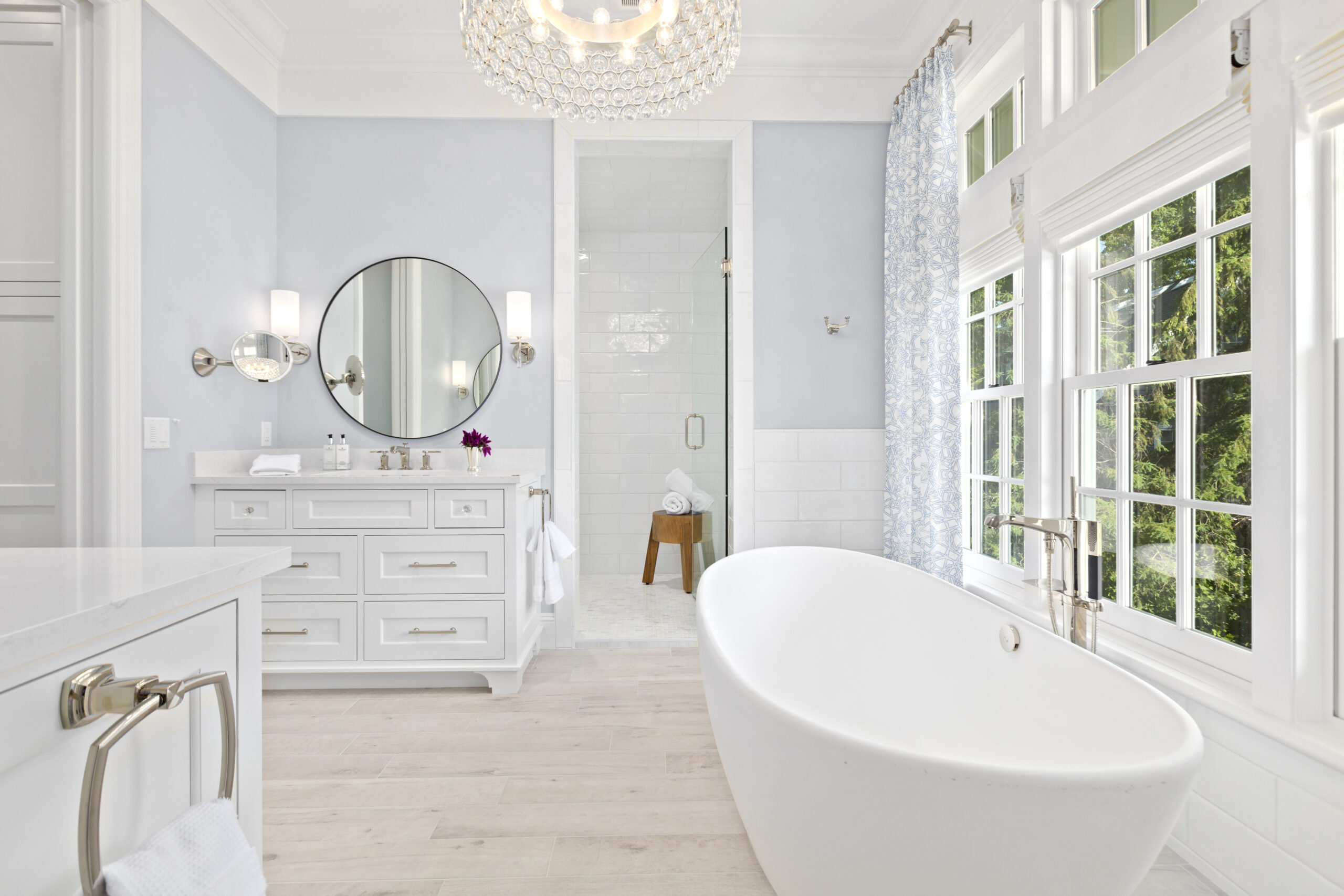
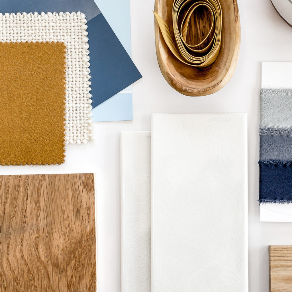
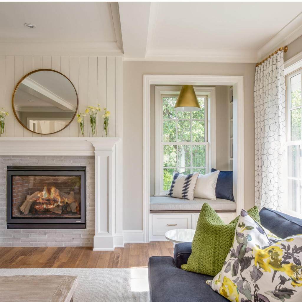
Another major mistake is failing to consider the existing undertones in your space. Every room has fixed elements such as flooring, tiles, countertops, and trim, each with its own undertone. Your new paint colour needs to complement these undertones to create a harmonious look.
If there’s one thing I understand well after taking Maria Killam’s “True Colour Expert” Certification and being a member of her True Colour Insider community, it’s that undertones matter! And they matter A LOT!
You CANNOT (please don’t!) choose a paint colour correctly in total isolation. You can’t just pick a paint colour because you love it or because your favourite blogger used it in her home and it looks good in her photos.
Pay close attention to the undertones of your fixed elements in your space.
What do I mean by this?
My training as a “True Colour Expert” has taught me that if you have a beige sofa with a pink undertone (which is quite common), introducing a seemingly neutral and innocent beige paint colour that happens to have a yellow undertone is going to make your pink beige sofa look dirty. Not a look we’re aiming for! In other words, mixing too many unrelated neutrals results in an unbalanced and disharmonious appearance.
Or say you’ve inherited a home that has a granite countertop with flecks of brown, yellow, and gold. If you’re not replacing the countertop, then choosing a paint colour that does not complement this established warm yellow undertone would be a major decorating misstep. In other words, pair it with stark true white walls, and it’s just not going to look good together. And all that money you have spent on paint! So frustrating.
Ensuring all your undertones are cohesive and get along is essential because mismatched undertones can clash and make your space look disjointed and unappealing, rather than harmonious and inviting.
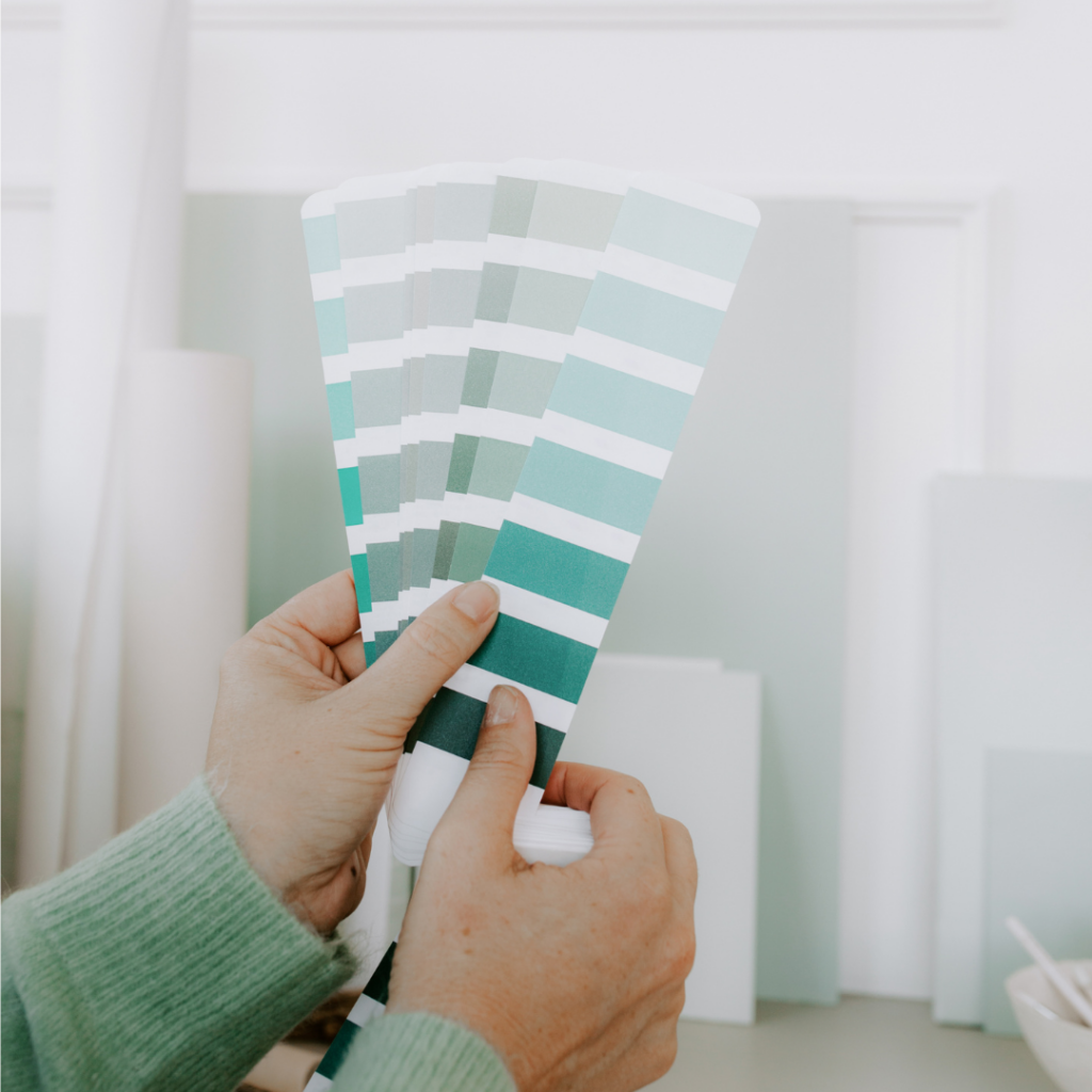
A helpful TIP TO IDENTIFY UNDERTONES in the space you are decorating is to place your fixed elements like tiles, carpet, or countertops next to a piece of pure white paper or a true primary colour (red, blue, yellow) to reveal any subtle undertones.
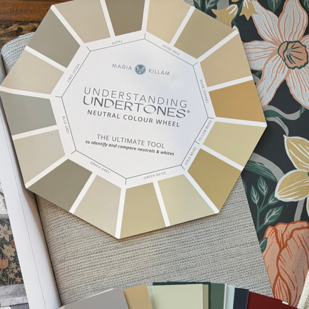
Using a tool like the Maria Killam “Neutral Colour Wheel” can also help you identify and compare these undertones accurately.
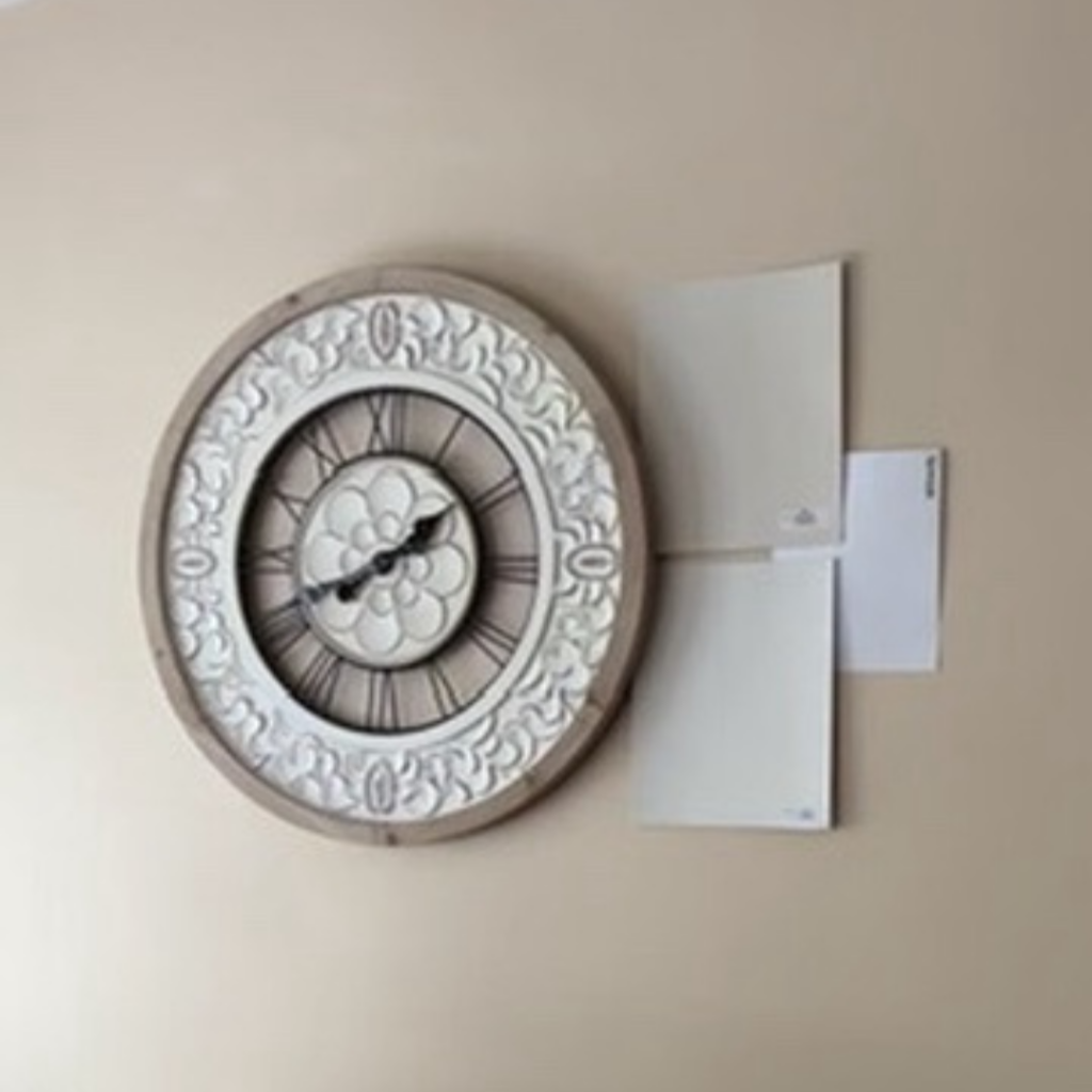
Finally, create your own large paint colour samples and place them next to your fixed elements to see how they interact in your space.
AND if you’re still uncertain or want some expert advice, it might be worth hiring a “True Colour Expert” like me to ensure you choose the perfect paint colour that complements the fixed elements in that space. Ignoring undertones can lead to a mismatched and unappealing look that you’ll regret.

Mistake #3: Not Testing the Paint Colours
Lastly, not testing paint colours—or testing them improperly—is a big mistake. Those tiny paint chips from the store are simply too small to give you an accurate idea of how the colour will look in your space. I’ve seen customers tape up these tiny paint chips in the middle of their walls, and I often think, “How on earth could you ever make a correct decision using that method?” There’s honestly just no way.
To truly understand how a colour will look, you need to test larger samples.
Here’s what I recommend:
Choose the top colours you’re considering and get sample cans of those paints. Then, grab some bristol board and paint each colour on a separate piece, leaving a white border around the edges.
Place these painted boards in various areas of your space and next to your fixed elements—don’t just stick them in the middle of the wall. This method lets you see how the colour interacts with your room’s lighting and existing features like flooring, carpets, tiles, built-ins, and countertops. Always test multiple colours to compare and find the perfect shade.
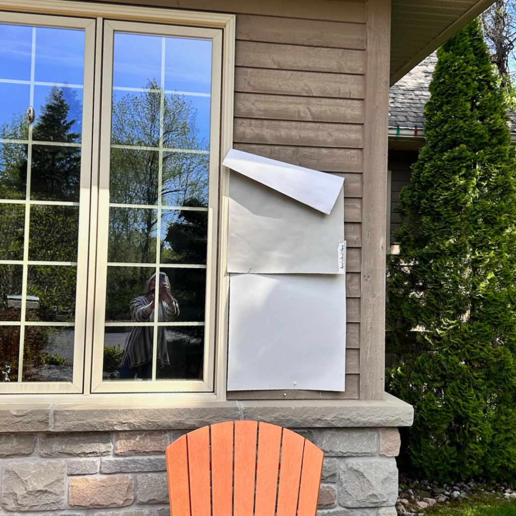
Case Study: Exterior Paint Colour
I worked with Tom and Lisa who were eager to repaint their home’s exterior. They initially picked a colour from a tiny chip and were excited to get started. However, when they saw the result, they were disappointed as the colour didn’t match their vision. They came to me feeling frustrated. I guided them through the process of testing larger samples on bristol boards. They placed these samples in different spots around their home and against their existing elements. After a bit of testing, we found a colour that perfectly complemented their home and truly enhanced its curb appeal. It was worth the time and effort and getting the right colour on their exterior made all the difference.
For more tips on testing exterior paint colours, be sure to check out my blog here.
Tools and Resources
Color Visualization Apps: Apps like Sherwin-Williams ColorSnap and Benjamin Moore’s Personal Color Viewer can help you visualize paint colours in your space.
BeautiTone Color Finder: Home Hardware’s BeautiTone Colour Finder is a great tool for exploring colour options and seeing how they look in different settings.
Pinterest: Use Pinterest to gather inspiration and see how different colours look in real homes.
Consultations: Consider booking a professional paint colour consultation with a certified “True Colour Expert“ like ME for personalized advice.
Choosing the right paint colour can feel overwhelming, but avoiding these common mistakes will help you make a confident and informed decision. Take your time, consider the existing undertones, and always test your colours.
And if you still need assistance, my paint colour consultations are here to help, whether you’re in the Kawartha Lakes area or need virtual advice.
The right paint colour can truly transform your space, so let’s make sure you get it right!
By following these tips, you’ll be on your way to a beautifully painted space that you’ll love for years to come. If you have any questions or need further guidance, don’t hesitate to reach out.
Happy painting!