Hi there my fellow decorating enthusiasts! Today, I want to talk about something that’s been on my mind lately: GREEN. Now, I’ve always had a soft spot for blues – they’ve been my go-to for as long as I can remember. Perhaps it’s because I live in cottage country and anything that reminds me of the lake instantly feels like home. But recently, I’ve found myself drawn to green, and it’s been a refreshing source of inspiration.

Take, for example, this stunning BeautiTone green paint colour I’ve recently become obsessed with called “Jamaica Me Crazy.” The name alone gives you a hint of the vibe it brings – soothing, calming, and just the right amount of fresh. We painted some shelving units in our store this colour and it’s added so much life to our display, perfectly complementing our organic, eco-friendly products. And to be honest – it’s rubbed off on me! I’ve even started considering bringing a touch of green into our lake home, which has always been decked out in blues and off-whites.
Someone who has been showcasing the green trend in such an inspiring way is the popular blogger and decorator Emily Henderson. She recently featured a beautiful deep organic shade of green in a kitchen makeover, painting the homeowner’s cabinetry in Sherwin Williams “Rosemary”. I love how this rich green paint colour with a subtle gray undertone gives such depth to this space!
So now, it seems I’ve developed a new favourite colour palette – soft, muted greens and blues coming together to create a soothing, warm, and inviting aesthetic. Everywhere I look these days, I notice this cohesive colour palette, whether it’s featured in a serene piece of art or an inviting area rug.
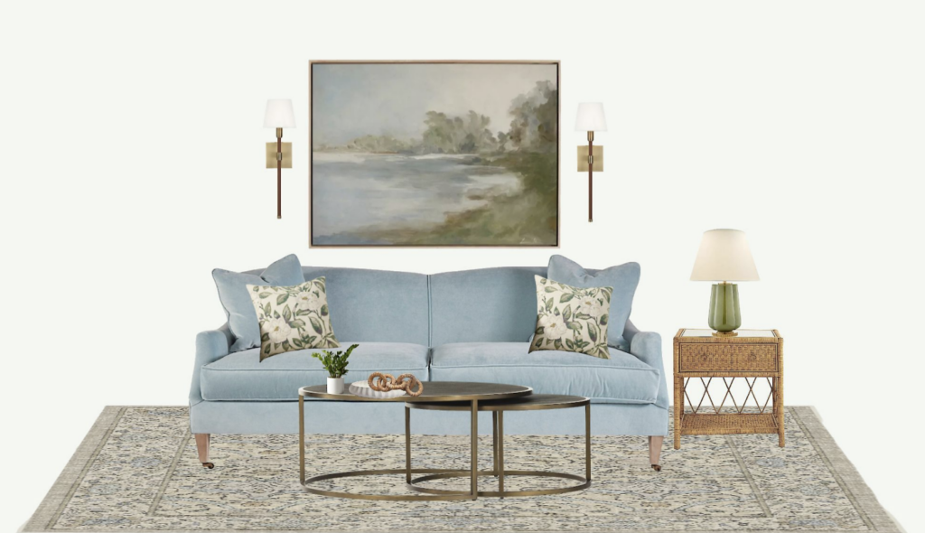
For instance, take a look at this Mood Board I created showcasing this tranquil artwork from McGee & Co. called “Lake” that beautifully captures the calming harmony between blue and green. I used it as my colour inspiration and also found these vintage looking “Magnolia” pillows at Pottery Barn and this soft sage green area rug from Ruggables.
Now let’s get really focused on green and take a closer look at what it has been doing in interior decorating lately and why it’s capturing so much of our attention.

The Green Trend in 2024:
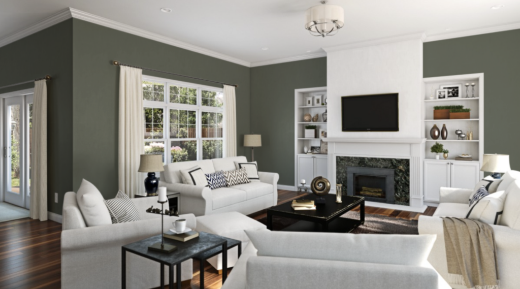
Let’s first talk about the resurgence of forest green. Now, I don’t know about you, but I haven’t seen this much forest green since the ’80s. Yet, here it is, making a comeback in a whole new light – richer, much more elegant, and downright luxurious. It’s a delightful twist on a classic, adding depth and moodiness to interiors in a way that feels both nostalgic and yet utterly modern. In other words, it’s nothing like the forest green that touched everything in the 1980’s, thank goodness!
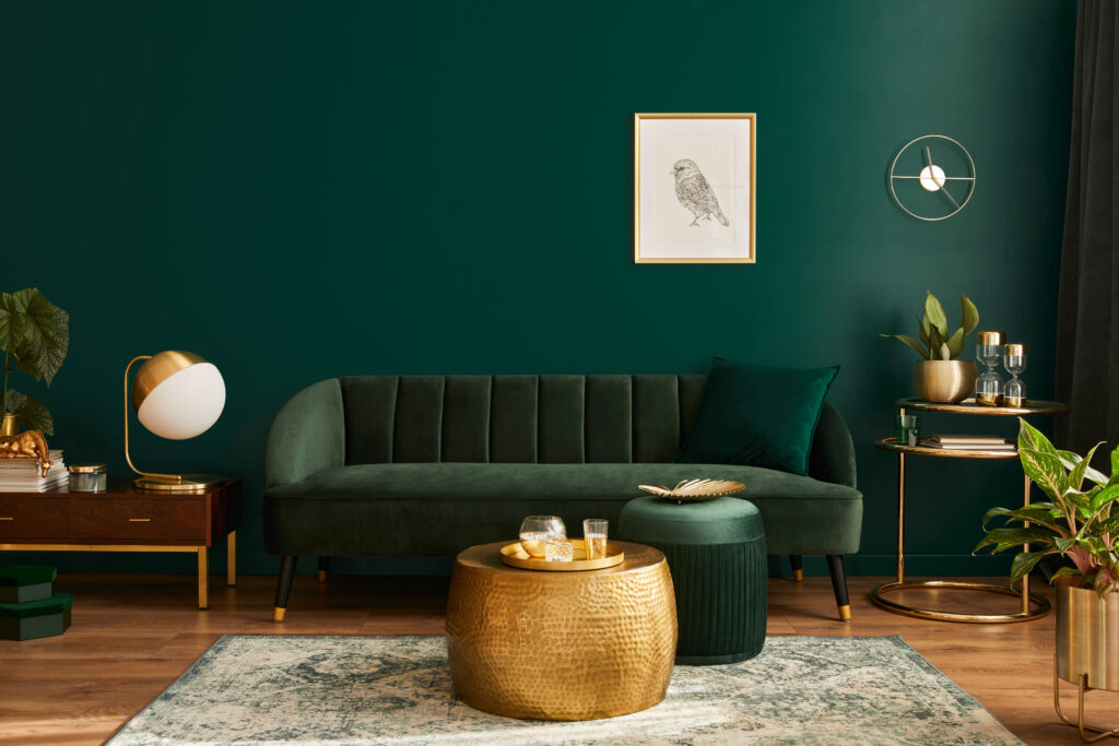
But forest green isn’t the only shade showing up in the design world these days. Emerald and jade greens have also been noteworthy, adding a touch of opulence and sophistication to interiors everywhere. These jewel tones bring a sense of drama and richness that’s hard to ignore, making them perfect for creating statement walls or adding pops of colour to more neutral palettes.
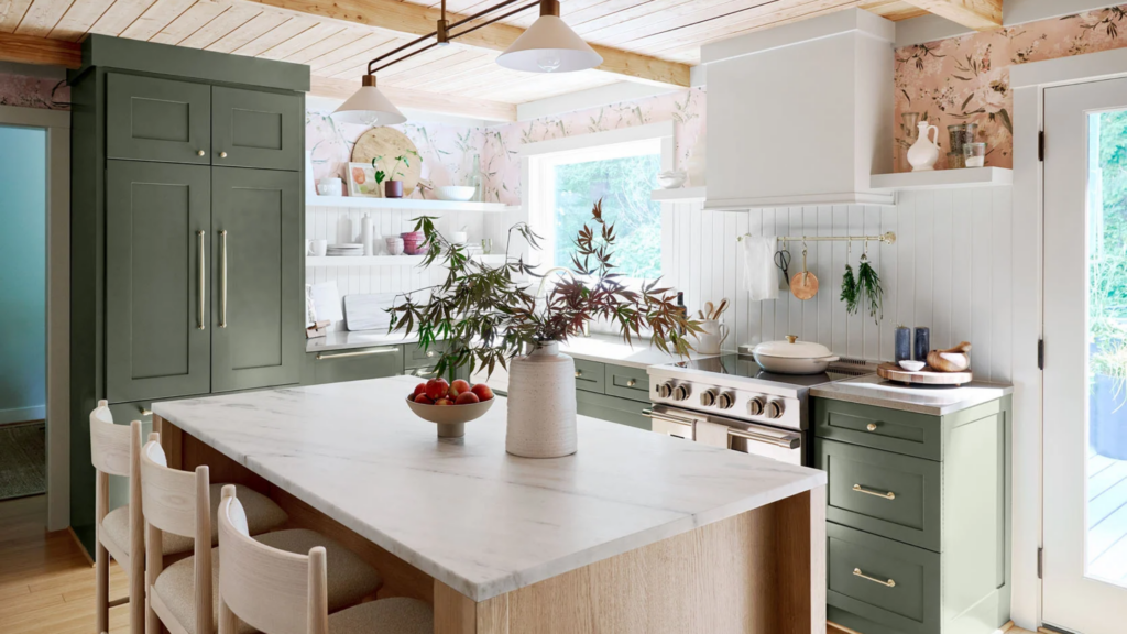
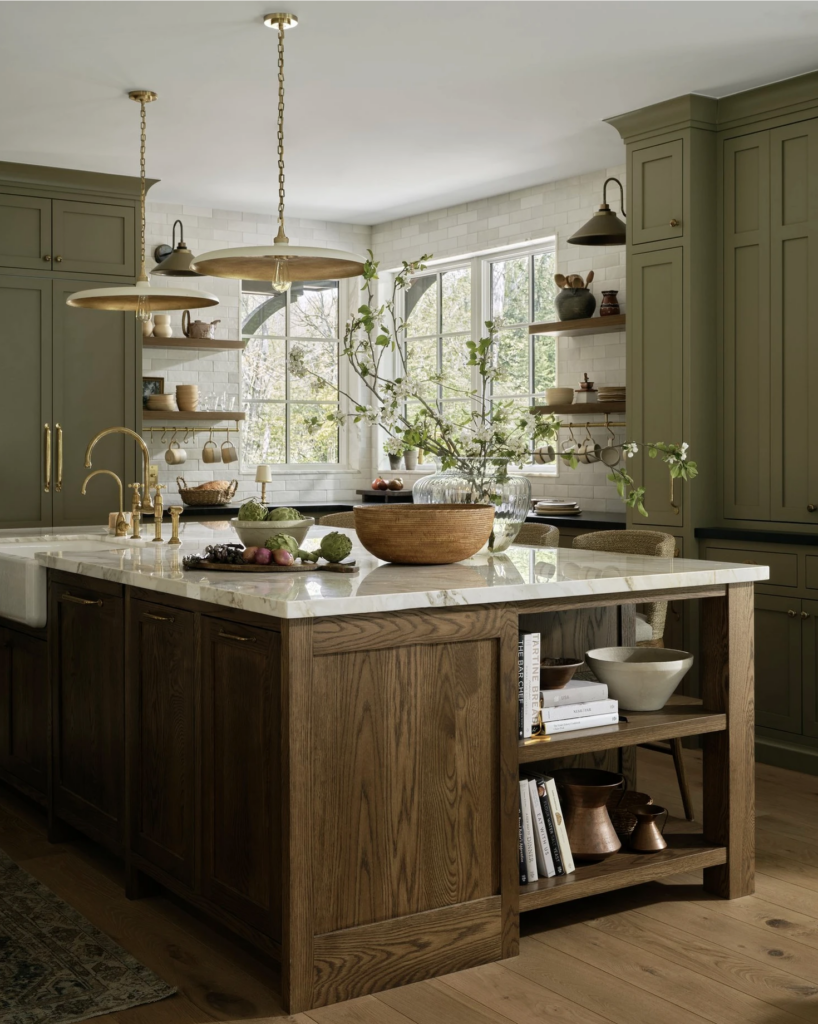
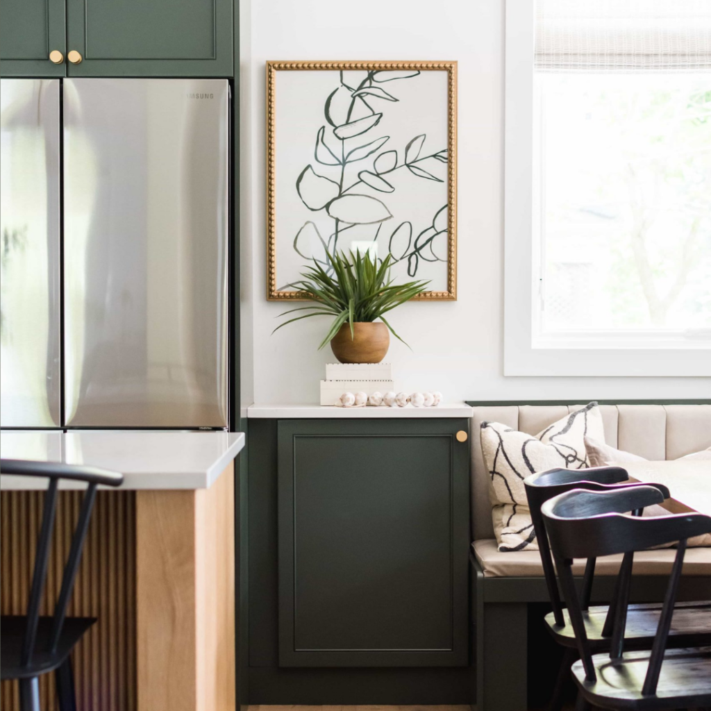
Of course, not everyone is ready to dive headfirst into the world of saturated or bright greens. That’s where softer, more muted greens come into play. Think warm earthy tones like the shade of these gorgeous, traditional cabinets in this kitchen designed by Tiffany Leigh Design. The paint colour “Crownsville Grey” by Benjamin Moore offers a much warmer, more subtle approach to incorporating green into your home, adding such a calming effect but without demanding too much attention. In fact, could you say it almost reads as a neutral? I don’t see this English Country style kitchen becoming dated anytime soon!
Choosing the Perfect Green Paint Colour: Tips from a Pro
Now that we’ve explored the allure of green in interior design, let’s get down to the practical: how to choose the perfect green paint colour for your space. As a paint colour consultant, I’ve had the pleasure of helping clients navigate the wide array of greens available, and I’m here to share some of my top tips with you.
First and foremost, it’s essential to consider the overall vibe and style of your space. Are you aiming for a cozy, rustic feel, or perhaps something more sleek and modern? The right shade of green can help set the tone and enhance the atmosphere you’re trying to create.
Green is incredibly versatile in this regard – it can evoke a sense of opulence, richness, and luxury, making it perfect for creating a lavish, indulgent space. On the other hand, brighter greens can inject vibrancy and energy into a room, perfect for those seeking a more lively and dynamic atmosphere.
Once you’ve determined the overall look and feel you’re aiming for, it’s time to narrow down your options and focus on specific shades of green that will meet your objective. Get creative and have some fun with this process. Dive into Pinterest and start searching for green paint colours that align with your vision. You can try searching for phrases like “warm earthy green paint colours” or “vibrant bright green paint colours” to find inspiration.
Additionally, consider factors such as the size and layout of the room you want to decorate, as well as any existing elements that you want to complement or highlight. Are you drawn to the classic look of green walls contrasted by white trim, or are you envisioning a moodier, all-over green that covers both the walls and trim work?
With countless green paint colours available, it’s essential to narrow down your options based on these considerations. By doing so, you can ensure that the green paint colour you choose will not only look beautiful but also feel perfectly at home in your space.
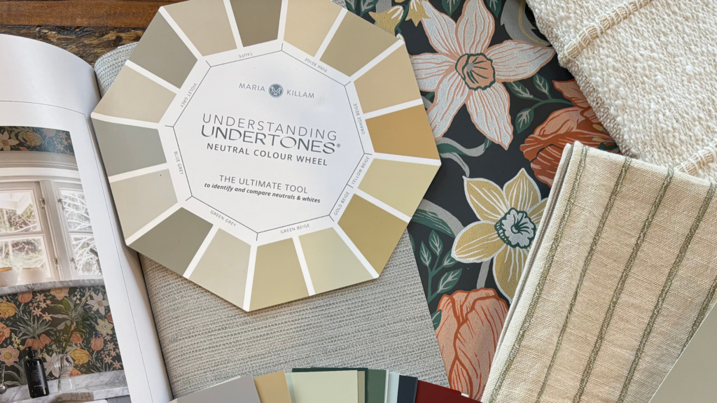
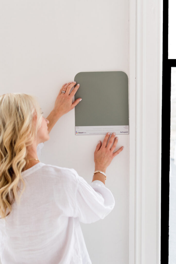
Next, it’s crucial to pay attention to undertones. As a paint colour consultant, I wouldn’t be doing my job if I didn’t remind you of this important aspect. As my favourite colour teacher Maria Killam has taught me, you need to ask yourself: is this warm or cool? Clean or dirty? And what’s the undertone? Some greens lean towards the warmer end of the spectrum, while others veer towards cooler tones. This distinction is crucial because it can significantly impact the overall look and feel of your space.
Warm greens, with their yellow undertones, tend to create a cozy, inviting atmosphere, perfect for spaces where you want to evoke a sense of warmth and comfort.
On the other hand, cooler greens, with blue undertones, can lend a refreshing, calming vibe to a room, ideal for areas where you want to promote relaxation and tranquility. I particularly love these cooler tones for a lake home!
Also, some green paint colours will appear “cleaner,” while others may have a more “earthy” or “muted” quality. You don’t want to mix a fresh pastel mint green wall colour with say an earthy green-grey couch. Keeping these distinctions in mind when choosing a green paint colour will help ensure that you select a shade that aligns with your desired aesthetic and complements your space’s existing elements.
Don’t Forget to Consider Existing Finishes and Natural Light
Now, let’s talk about the importance of considering the existing elements in your space when choosing a green paint colour. I beg you. Please do not just go to the paint chip rack and choose your favourite shade of green without considering the fixed elements in the space!
Everything from furniture and flooring to decor and accessories plays a role in determining how a paint colour will look and feel in your home. Even neutral colours like a cream sofa will have an undertone that can influence how a paint colour appears.
Therefore, it’s crucial to take note of your space’s existing finishes and decor to ensure that your chosen green paint colour will harmonize with them. For example, if your room is decorated in warm finishes and decor, such as wood furniture or brass accents, you’ll want to steer clear of cooler green wall colours that may clash with these warm tones. Instead, opt for a green paint colour with warm undertones to create a cohesive and harmonious look throughout the space.
Another crucial consideration when choosing a green paint colour is the natural light in your room. You’ll want to ensure that your green complements the space and the amount of light it receives. For instance, if your room faces north and tends to receive cooler, greyer light throughout the day, opting for a cool green colour or a green-grey hue may amplify this effect. As a result, the space might feel cold and dull, rather than the warm and inviting atmosphere you were aiming for. On the other hand, if your room is south-facing and receives ample sunlight throughout the day, you have more flexibility to play with cooler tones of green without the risk of the space feeling too cold or stark. Understanding how natural light interacts with your chosen green paint colour will help you achieve the desired ambiance and atmosphere in your space.
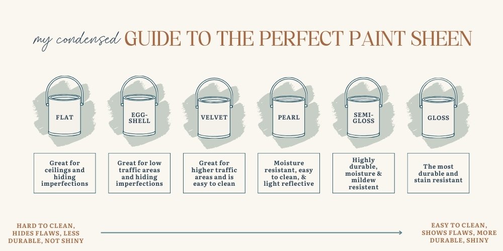
In addition to considering natural light, don’t forget about the importance of selecting the right sheen for your green paint colour. The sheen of your paint can have a significant impact on the overall look and feel of your space. For rooms that receive a lot of natural light or are frequently used, a higher sheen, such as satin or semi-gloss, may be preferable as it’s more durable and easier to clean. However, in spaces where you want to create a more subdued and cozy atmosphere, a matte or eggshell finish may be the way to go. In fact, some designers are even going for a flat finish! These finishes tend to absorb light, creating a softer, more muted appearance that can be especially flattering for deeper shades of green. But a flat finish wouldn’t be my first choice if I had little ones with dirty fingers or if it’s a high traffic area like a hallway. Ultimately, the choice of sheen will depend on your personal preference and the specific requirements of your space, but it’s an important factor to consider when selecting your green paint colour. For more great information and tips about paint sheens be sure to check out my blog [...…]
Incorporating Green into Your Decor
For those who are ready to fully embrace the green trend, there are endless possibilities awaiting. Picture gorgeous kitchens adorned with rich earthy green cabinetry or deep, moody living rooms enveloped in saturated green hues. These bold choices can make a powerful statement and transform your space into a haven of style and sophistication.
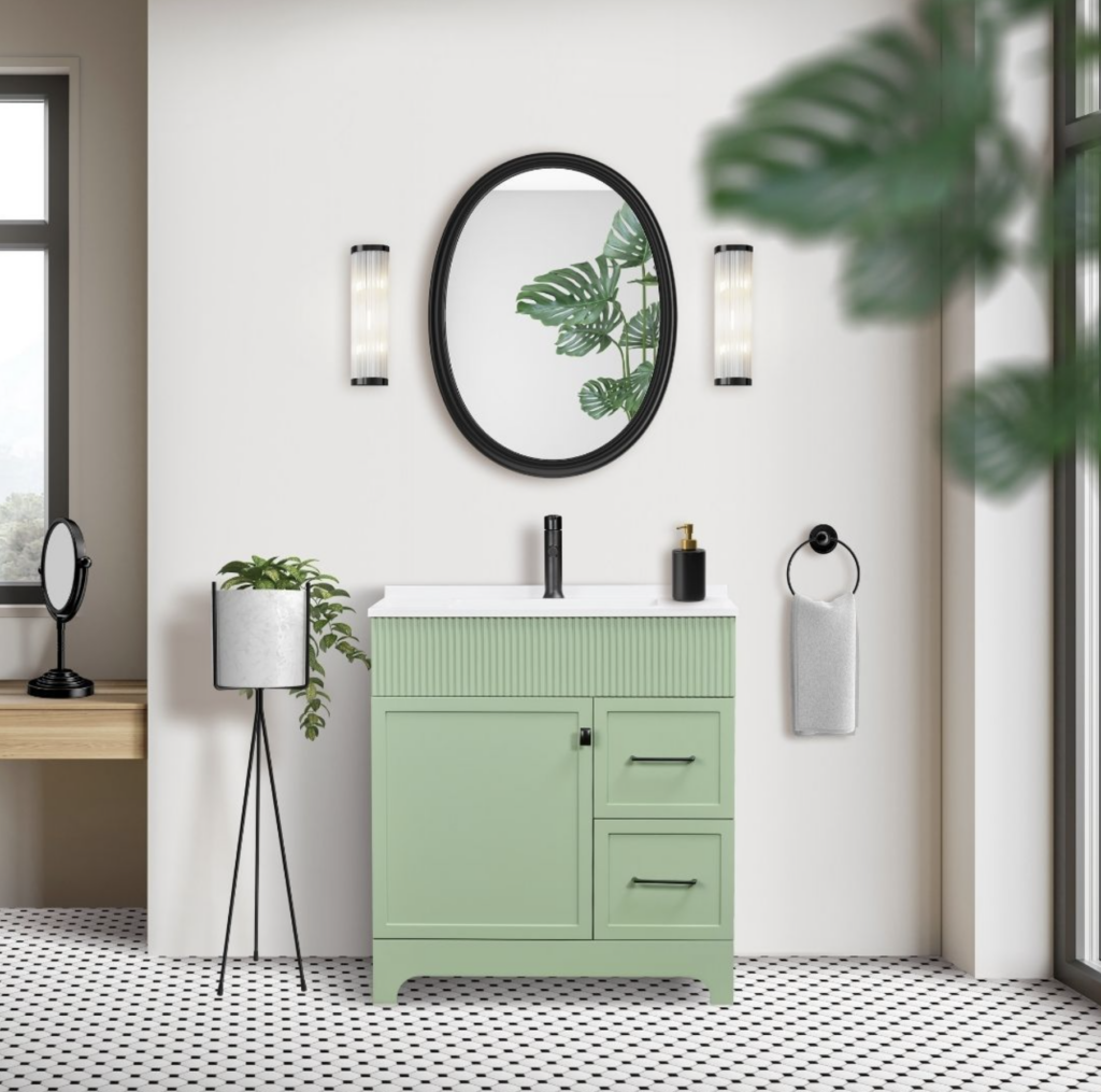
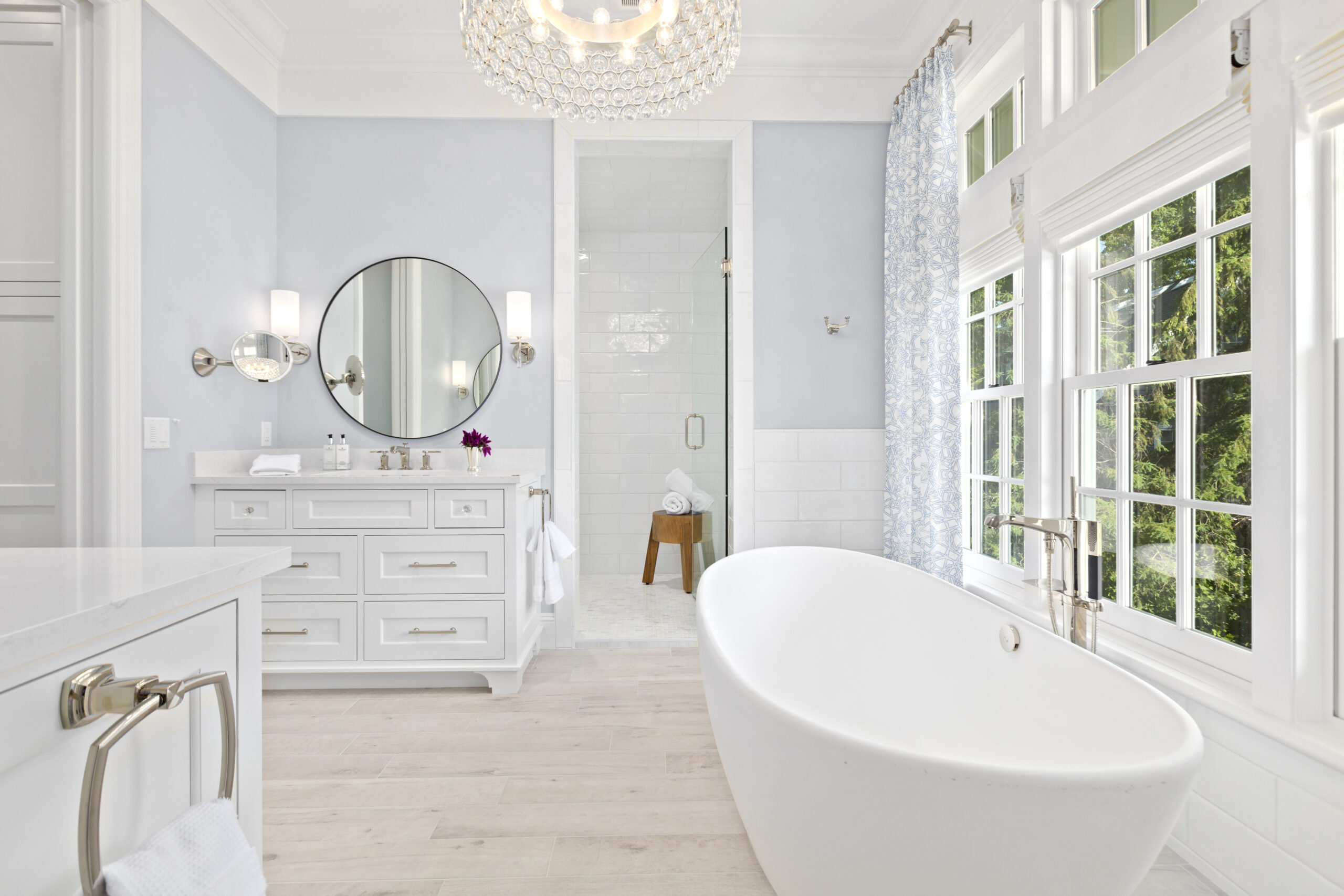
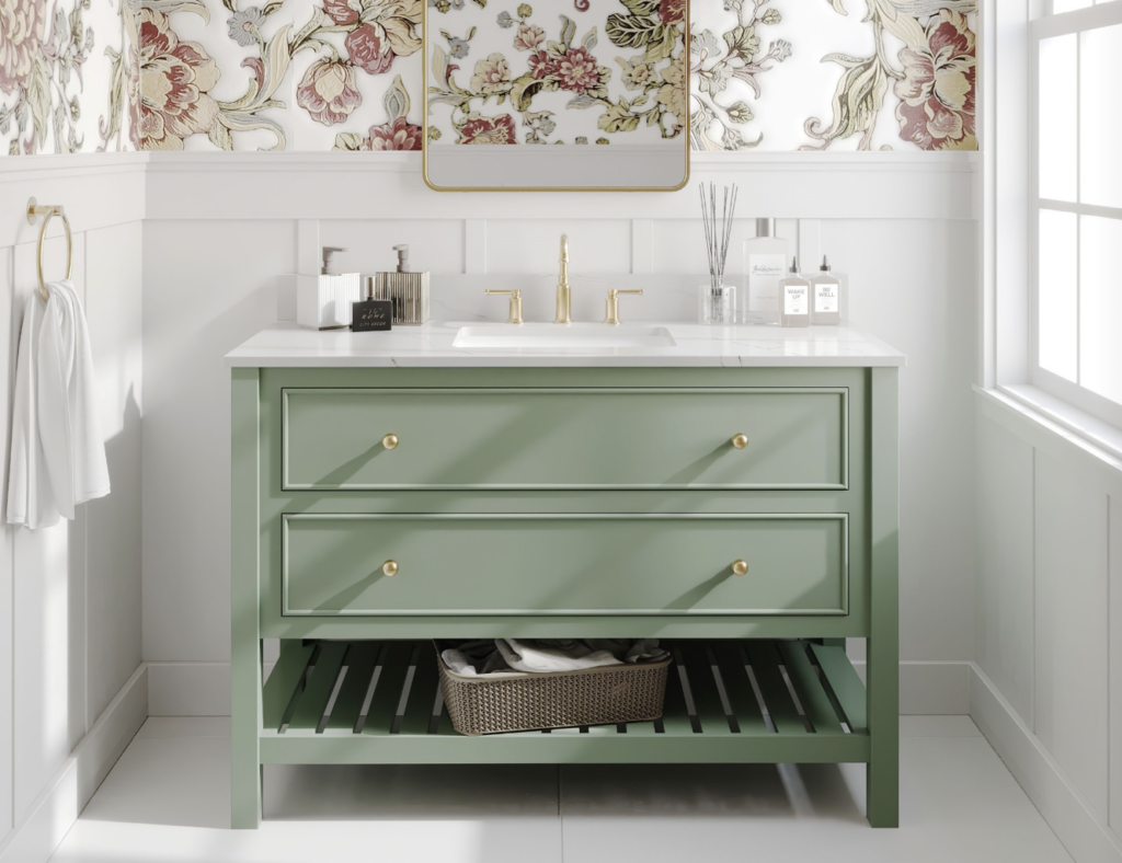
But if you’re not quite ready to commit to such a dramatic change, there are plenty of easier, less expensive ways to incorporate green into your home decor. Consider a striking “statement” green bathroom vanity! Or consider adding a few accent cushions in a beautiful pattern that incorporates the colour of your walls along with complementary shades of green, or investing in a stunning piece of artwork featuring serene landscapes or botanical motifs. With green trending as much as it is today, you’ll have no trouble finding decor pieces that seamlessly blend with your existing furnishings and colour scheme.
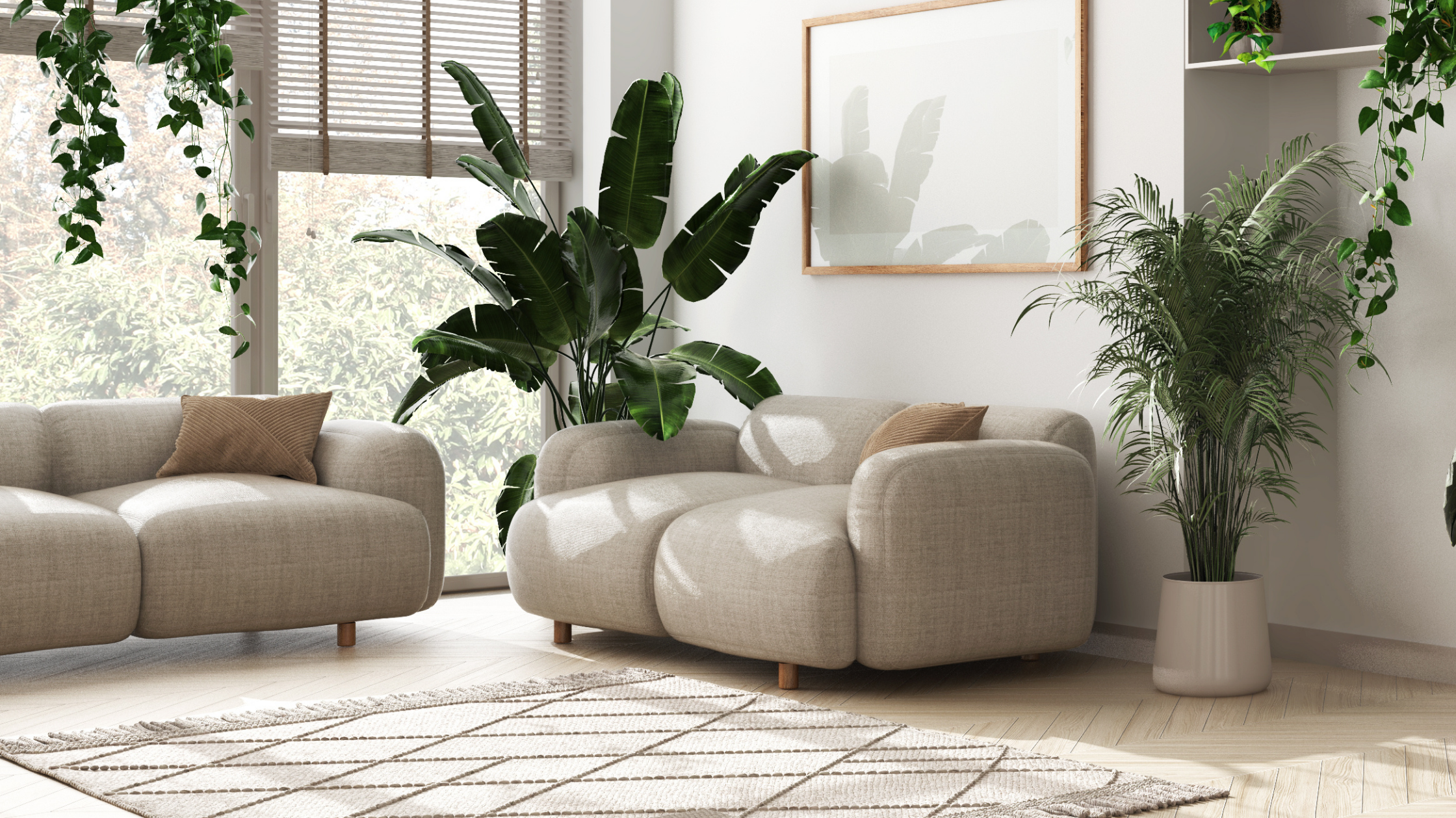
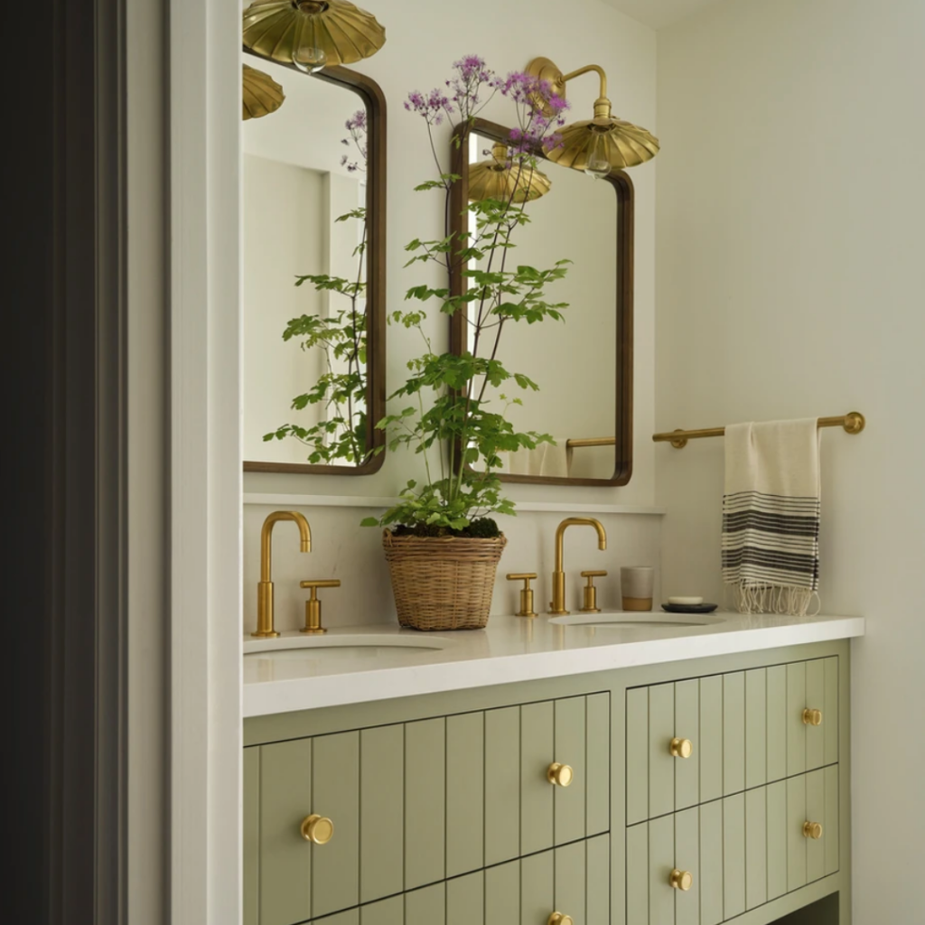
And let’s not forget about the power of plants! Adding some greenery to your space is not only a designer secret but also a surefire way to breathe some life into your decor. Whether you opt for a statement fiddle leaf fig or a cluster of small succulents, incorporating plants into your home adds depth, texture, and a vibrant pop of colour that can’t be beaten. That’s why you will always find plants in designer spaces!
So Do You Want to Embrace the Green Trend?
In conclusion, no matter what level of green you choose to introduce into your space, rest assured that there are plenty of options available to suit your taste and style. And with green showing no signs of fading from the forefront of decor trends, there’s never been a better time to embrace this versatile and timeless colour in your home.
So what do you think? I’d love to know your thoughts! What’s your favourite shade of green? How do you picture yourself using it in your space? Or perhaps you have a question about green paint colours? Let’s chat and swap stories – after all, that’s what makes this community so special!
For personalized paint colour recommendations check out my design service packages!