

When we purchased our lake home in 2018, my husband was super excited to spruce it up. So excited that he went ahead and booked a painter without giving me a more than a hot minute to consider my paint colour choices or decorating plans.

The Lily Pad Cottage
So I found myself in a rush to make a paint colour decision, which as a colour consultant I strongly advise against, and decided on Sherwin Williams “Extra White”. Why? Well, one of my favourite bloggers had used it on the walls of her own lake house, so I figured it was as good a choice as any given our time constraints.
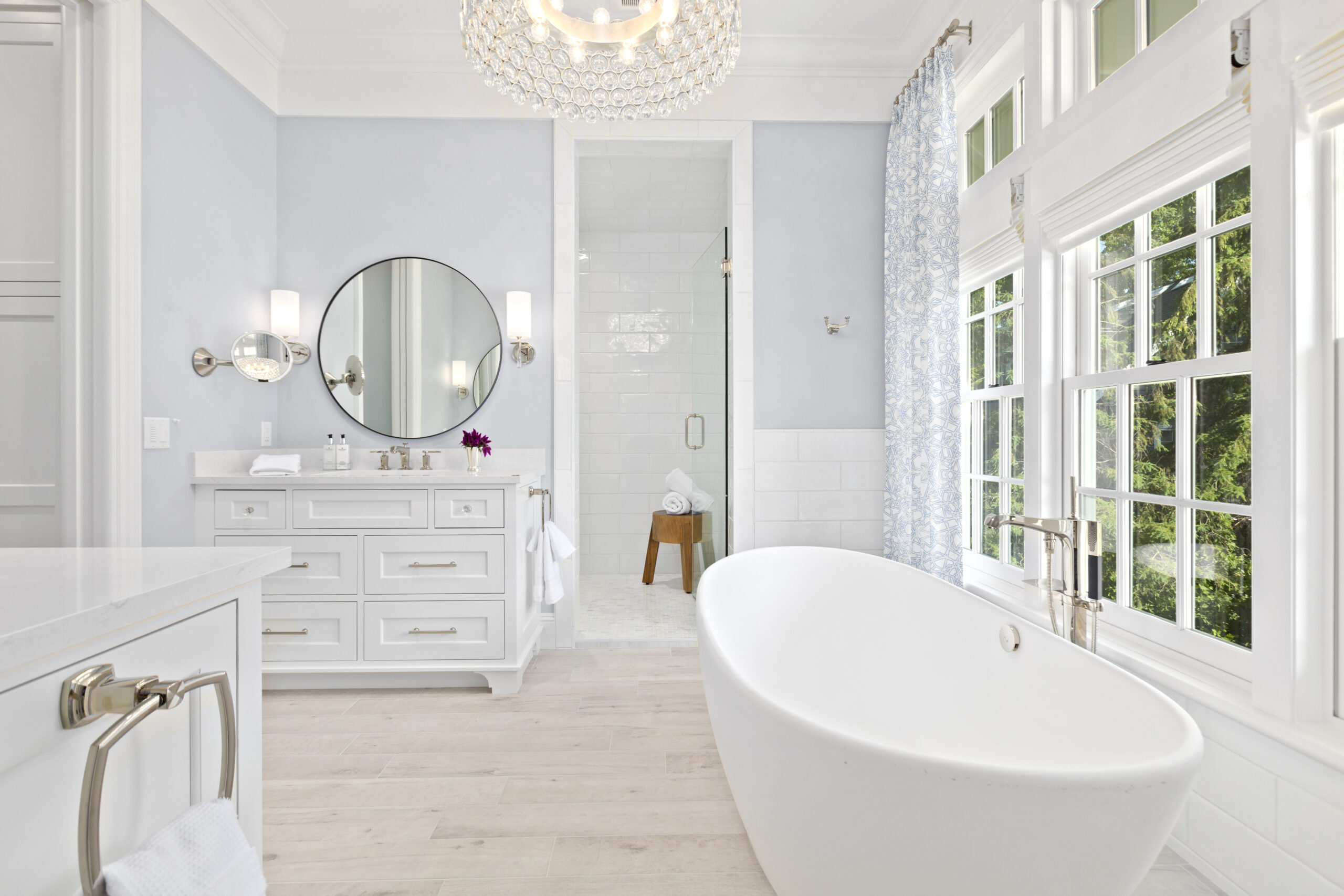
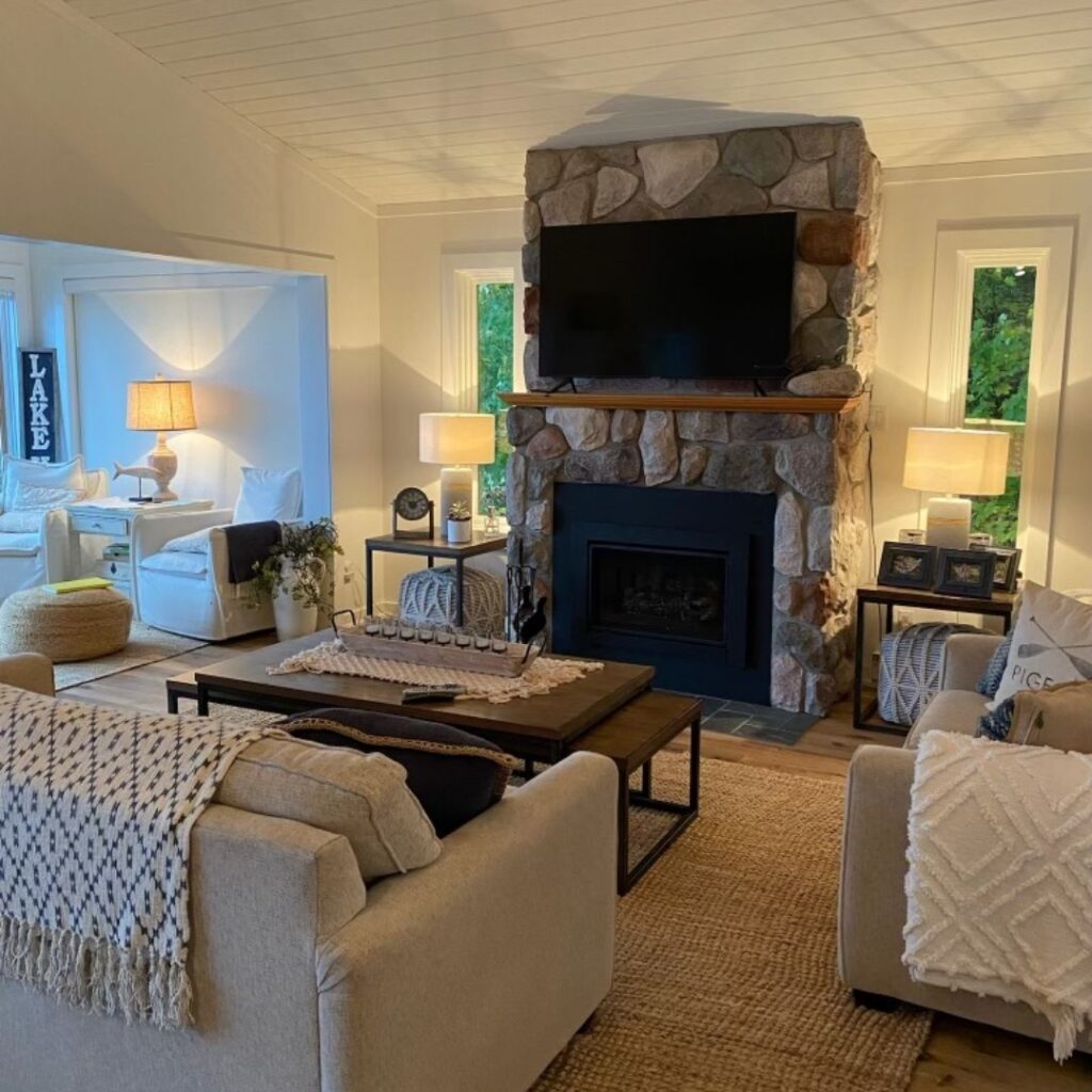
Fortunately, this bright white paint color, which has a blue undertone, worked well in our space, thanks to the abundance of large windows facing the lake that let in plenty of sunlight. Plus, my coastal-style decorating and neutral flooring helped to complement the colour palette in our main living area.
Fast forward a few years later, and we found ourselves in a similar scenario. Once again, my husband booked a painter for my new office/studio space and gave me only a matter of hours to choose a paint colour for the shiplap walls. You’d think I would have learned my lesson as a decorator and colour consultant, but time was not on my side, and I had to make a quick decision.
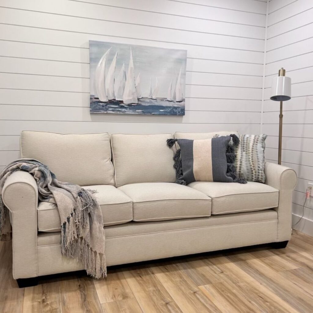
So in a rush, I blurted out “Extra White” by Sherwin Williams, hoping it would work its magic in my office as it did in our house. But deep down, I had a sinking feeling that the sneaky world of undertones would come into play. And sure enough, it did. The blue undertone of this paint colour, especially in a space with no windows, became painfully apparent, further emphasized by my off-white couch. UGH! Every photo or video taken in this space had a cold, dismal gray-blue hue, far from the inspiring atmosphere I had hoped for.
Tiffany Leigh Designs
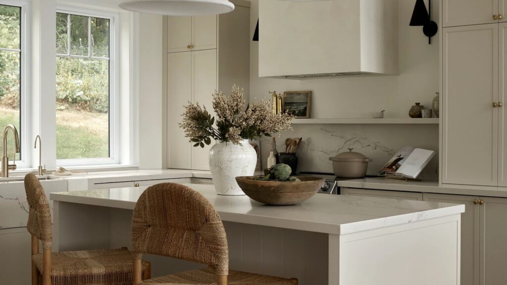
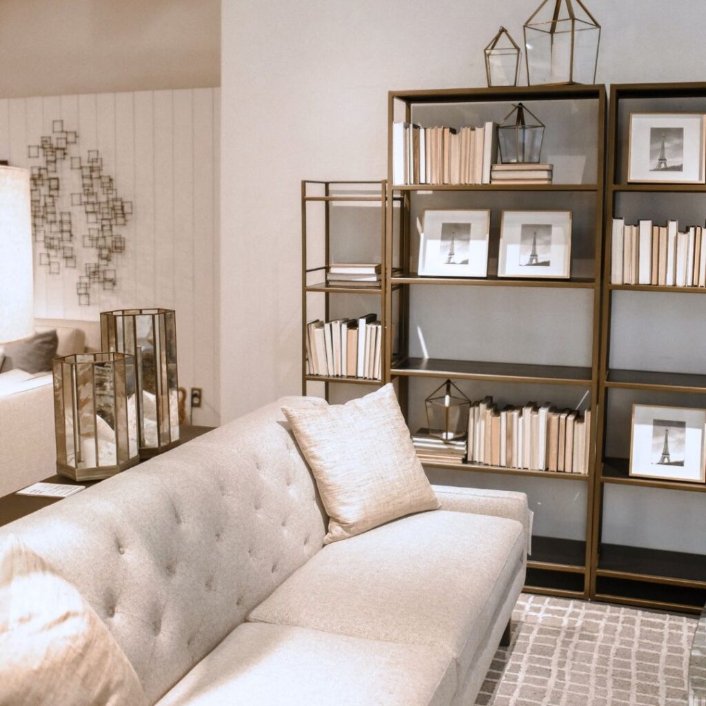
Fast forward to present day…it was bothering me so much I went ahead and repainted it, this time opting for a warmer off-white, Benjamin Moore’s “White Dove”. I decorated the space with warm, neutral furniture and added pops of my favourite blue, and now I absolutely love it! White Dove is a favourite white paint amongst designers. Check it out in this space by Tiffany Leigh Design.
So, what can you learn from my mistakes with white paint? First and foremost, it’s not as easy as it seems. White may appear to be the easy, go-with-anything, neutral choice, but with the world of undertones, it’s far from simple. So here are some things you should know before choosing a white paint for your space:
Undertones:
Undertones in paint colours are caused by tiny traces of different colours mixed together to create the main colour you see.
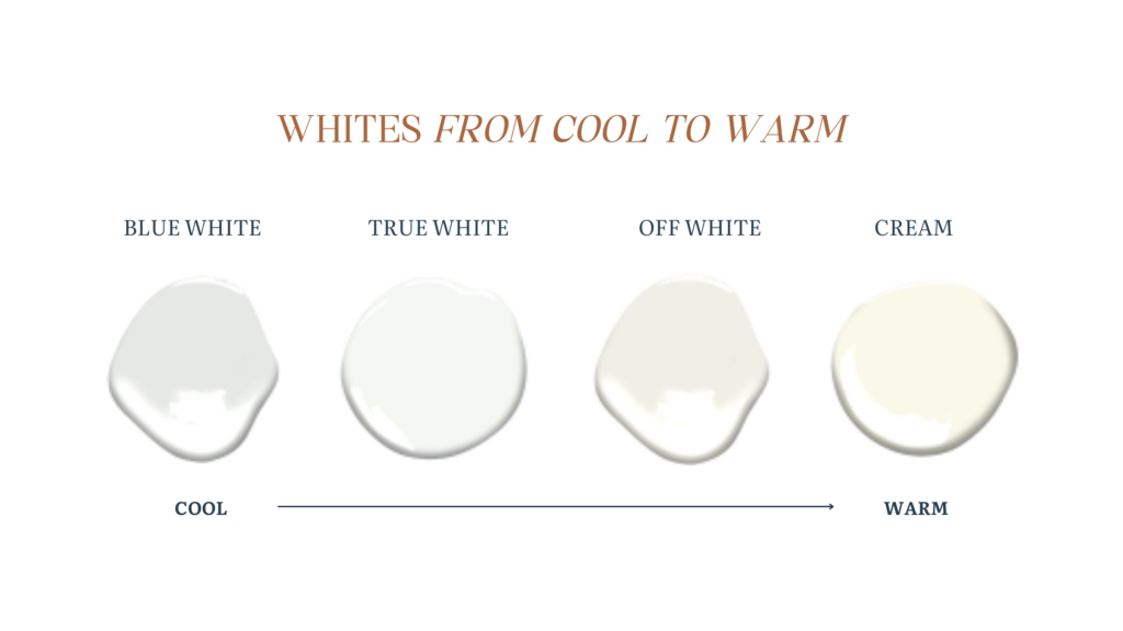
Imagine mixing different colours of paint to create a new colour. Even though you might mix mostly one colour, there are still tiny bits of other colours left behind. These leftover colours are what we call undertones. They’re like the secret ingredients that give the paint its unique character. When you paint a room, these undertones become more noticeable, affecting how the colour looks in different lighting. So, even though a paint colour might seem like a plain white or gray at first glance, it can actually have undertones of blue, yellow, green, or other colours hiding in it. It’s important to be aware of these undertones when selecting a white colour, as they can influence the overall look of a room.
Lighting Conditions:
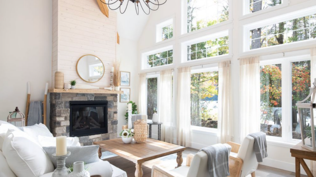
Lakeshore Designs
Did you know that the colour you select for your room can appear noticeably different depending on the lighting in the space, compared to how it looked in the store?White paint is highly reflective, which means it can easily reflect the colours of nearby objects and the lighting in the room. So, how much natural sunlight the room receives or the type of light bulbs you use in your home can have a big impact on how the paint colours in your room look.
Different light bulbs produce different kinds of light, which can make colours appear dull, intense, or even change their hue. For example, traditional incandescent bulbs produce a warm, yellowish light that can make colours appear warmer and more inviting. On the other hand, fluorescent bulbs often produce a harsh, cool-toned light that can make colours look dull and washed out.
LED bulbs are a popular choice because they come in a variety of colour temperatures, from warm to cool. This allows you to choose a light bulb that complements your paint colours and creates the mood you want in your room.
For a beautifully decorated room, I would recommend LED bulbs with a colour temperature of around 2700-3000 Kelvin, which produces a warm, soft white light. This type of light bulb tends to make colours look more vibrant and true to life, creating a cozy and inviting atmosphere in your home.
Surrounding Décor:
The colours of the furniture, flooring, and accessories in a room can also impact how white paint looks. White paint with certain undertones may clash with the colours of existing furniture and décor, creating an unbalanced or disjointed look.
For instance, imagine a living room with linen curtains on the windows that have a pink beige undertone. Now, picture an ivory-coloured couch with a hint of green undertone sitting in the same space.
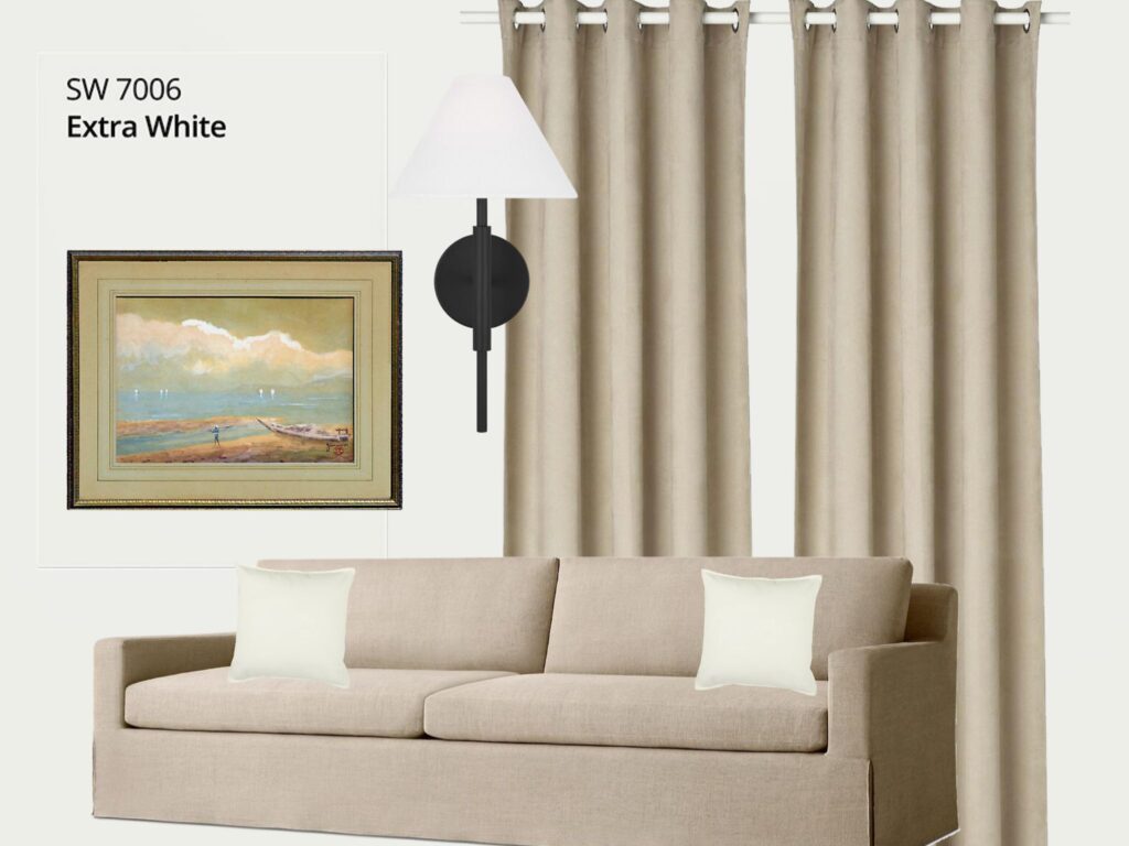
DON’T DO THIS
If you were to paint the walls of this room with a white paint colour that has a blue undertone, the combination could create a visually jarring effect. Something will just feel “off” about it. The clash between the warm undertones of the curtains and couch and the cool undertone of the white paint may result in an unbalanced and disjointed look. Therefore, it’s really important to consider the fixed elements and decorating in the space when choosing a white paint colour for the walls, to ensure harmony and cohesion in the room’s design.
Room Size and Layout:
The size and layout of a room can affect how white paint colours are perceived. In smaller rooms or those with limited natural light, white paint with cool undertones may appear stark or clinical, while warmer whites can help create a cozy and inviting atmosphere. This is what I experienced in my home studio office. It’s a small room with no windows and recessed LED lights. When I painted the walls with Sherwin Williams “Extra White”’ it appeared stark and cold instead of the beautiful, coastal colour that it is in our home. So while picking the right white paint for your room isn’t as easy as it seems because of undertones, light and the decor in your space you don’t need to feel frustrated or overwhelmed.
Expert Tip:
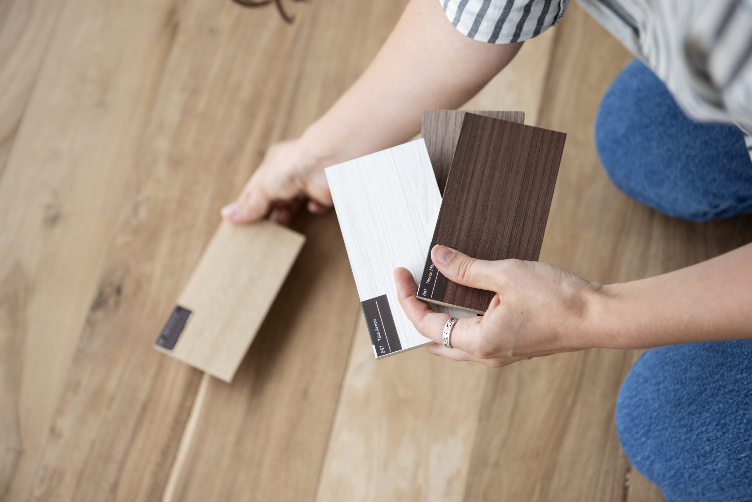
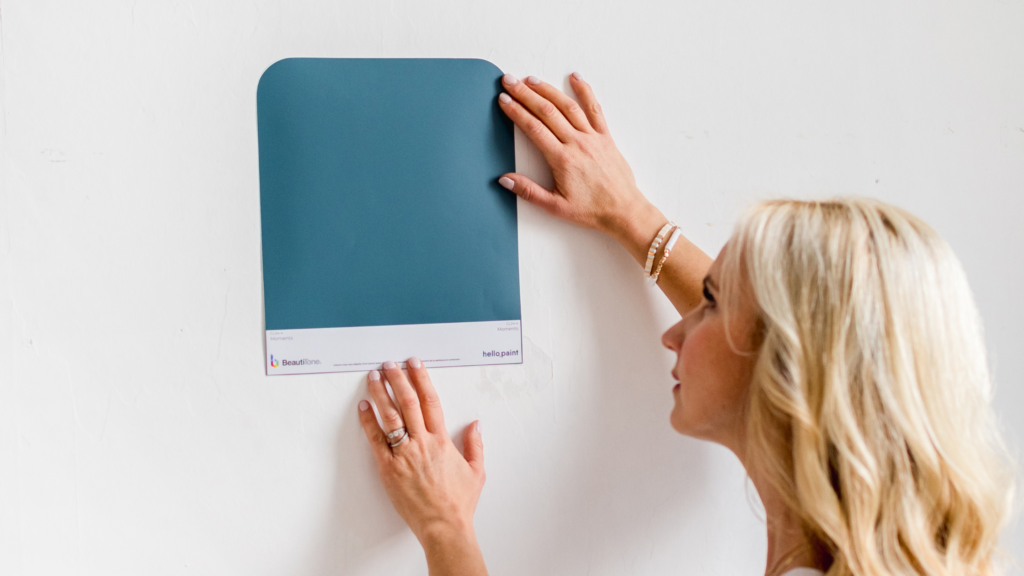
Here’s a simple tip so that you can confidently choose the right one for your space: test it first. As a paint colour consultant I can’t emphasize enough how important testing is. Just because a paint colour looks nice in someone else’s room doesn’t mean it will look the same in your space! That’s why you must test it out. You can get a sample peel and stick from “Hello Paint” or buy a small paint sample and paint it on a piece of bulletin board. Look at it in the space at different times of the day. And if possible, don’t rush the decision! It might take a bit of effort, but it’s totally worth it. Looking back, I wish I’d tested the paint before I painted my home studio office. Learn from my mistake and test your paint colours first to make sure you get the perfect look for your room.
Stay inspired,