


Choosing an Exterior Paint Colour: Excitement & Fear!
There’s nothing quite like painting the exterior of your home.
It’s such an exciting project, but it can also be daunting considering the time, money, and long-term commitment involved.
And let’s face it, the fear of making the WRONG colour decision!
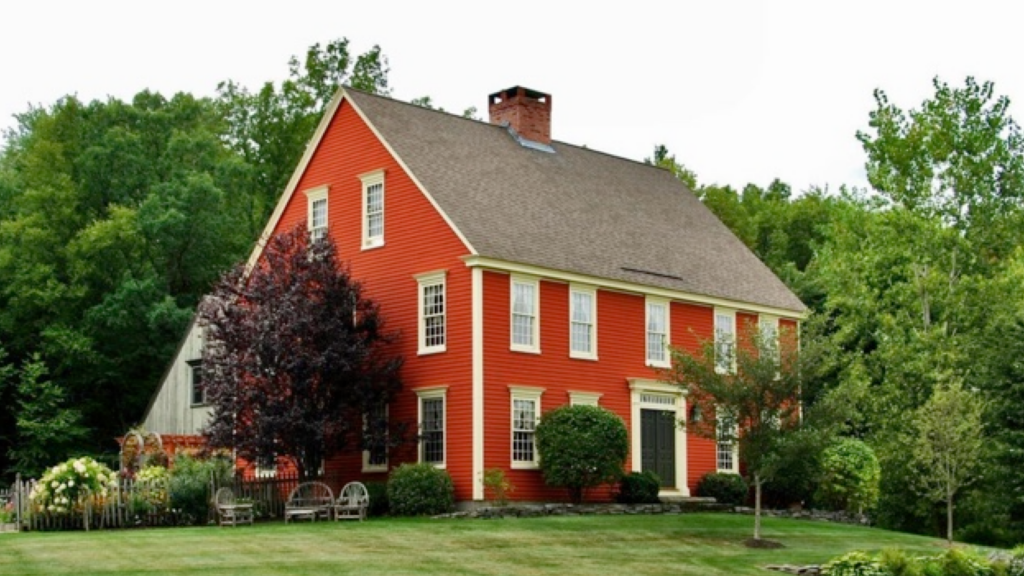
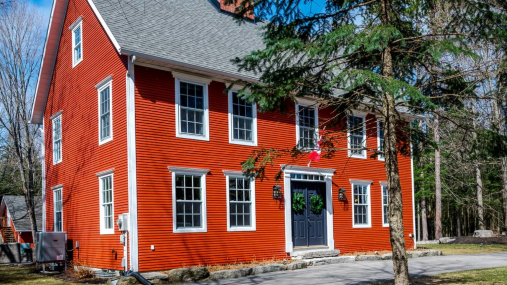
Our Colonial Home
Over the years, I’ve faced the challenge of selecting paint colours for our homes.
One particularly nerve-wracking decision was for our custom Colonial home, inspired by numerous trips to New England to study its architecture.
I scoured magazines, books, and even tried to uncover Martha Stewart’s secrets for her Colonial before realizing that what I truly wanted was a timeless, traditional look.
After much deliberation, we settled on a stunning red-orange inspired by a colonial in Deerfield, Connecticut.
It was a decision made with care, involving testing different colours and investing in paint samples, but it was worth it.
Even today, the colour remains eye-catching and perfectly suited to our home’s style!
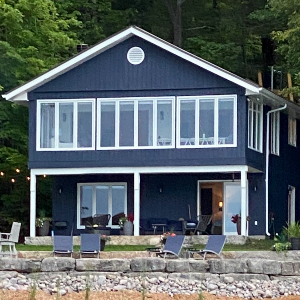
Our cottage
Then, in 2018, we purchased a cottage by the lake that was in desperate need of a paint job.
After researching colours suitable for lake homes, we settled on Hale Navy by Benjamin Moore.
The transformation was remarkable, turning the worn-out cottage into a more substantial, inviting space, especially when paired with white trim.
It was another decision that took time and consideration, but one that paid off in the end.
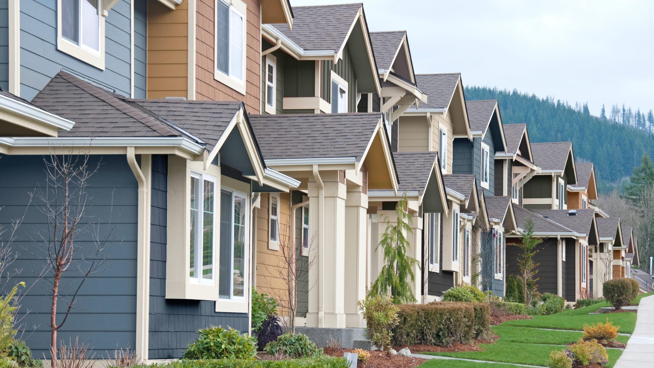
Exterior Colours for 2024
Now, I’m excited to tell you about the paint colours featured in the 2024 colour collections, particularly those by Canadian paint brand BeautiTone Paint.
The colours in this collection not only reflect current trends but also possess a timeless quality.
Timeless is something I care about deeply because no one wants to re-paint their home at the end of a “trend cycle”.
The colours this year embrace warm, earthy hues, moving away from stark whites to softer, creamier neutrals and rich, saturated blues and greens.
Grey remains popular but in softer, more silvery tones, particularly suited to cottage country.
I can’t wait to share more about each of these colours and why they’re perfect choices for your home’s exterior palette so let’s get started!
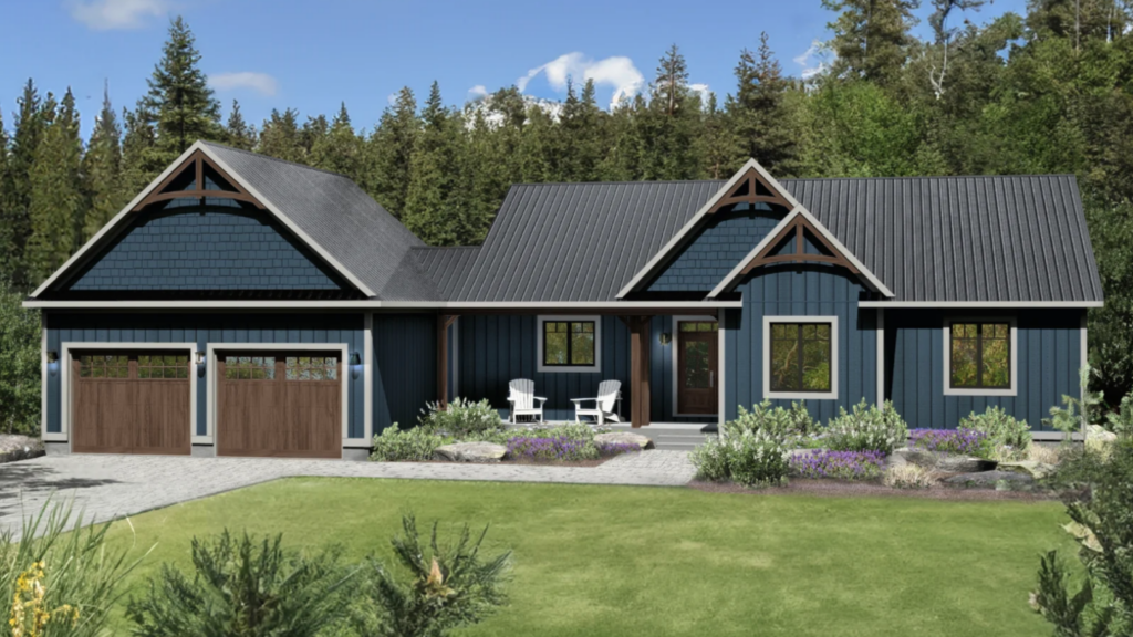
The Timeless Appeal of Blue:
If you know me at all, you know that blue is my favourite colour.
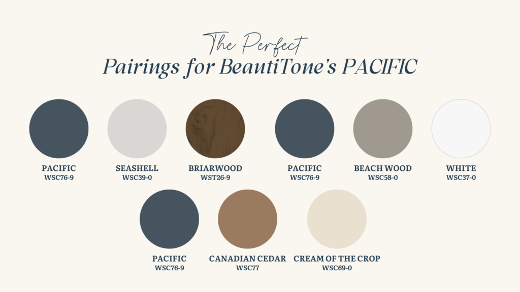
So we will begin by talking about why I’m really loving this shade of blue, called “Pacific”, for your home’s exterior.
Blue has this timeless appeal, you know?
The right one can be like a classic pair of jeans that goes with everything!
In fact, at a recent Maria Killam colour conference I attended in Chicago, one of my fellow decorators said that at her design firm they refer to blue as “blue-tral” because it so often reads like a “neutral”.
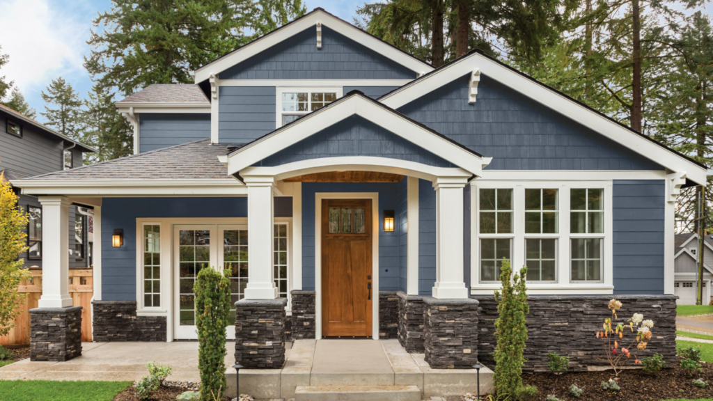
What’s got me excited about Pacific is its depth. It’s not your average blue; it’s got this richness that adds so much character to your home. And the best part? It’s versatile. Whether your home has a traditional vibe or leans towards modern, Pacific just works.
But here’s the real kicker: blue is just so darn comforting. It’s like wrapping your home in a cozy blanket, creating this welcoming atmosphere that’s hard to beat.
So, if you’re thinking about giving your home’s exterior a fresh coat of paint, definitely consider blue, especially Pacific. It’s a choice you won’t regret.
Neutrals are Warming Up:
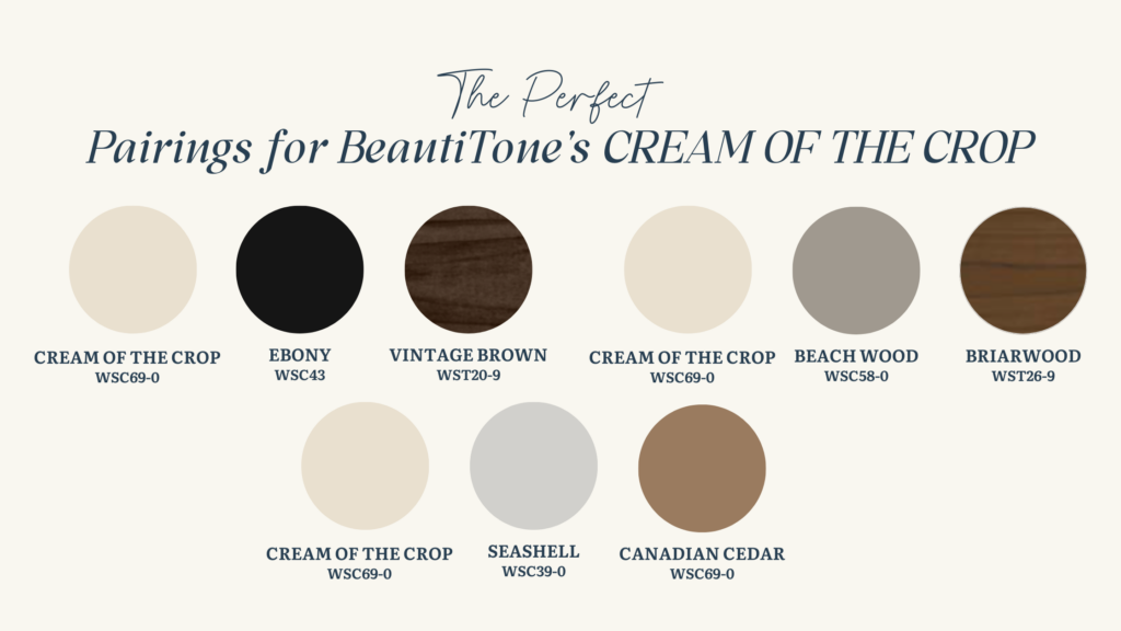
Let’s talk about BeautiTone’s “Cream of the Crop”. It’s a warm, creamy hue that’s been gaining popularity for good reason. You see, there’s been this shift towards warmer neutrals recently, moving away from stark whites with black trim. Cream of the Crop fits right into this trend, offering a comforting undertone that reflects the natural elements around us, like sand and stone.
But here’s what’s really neat: lighter colours like Cream of the Crop have a hidden benefit. They actually make your home look bigger. It’s a designer trick. By reflecting light, lighter colours create this illusion of space, making even the coziest of homes feel more open and inviting. So, not only does Cream of the Crop add warmth and charm to your home’s exterior, but it also gives it that extra bit of visual spaciousness—a win-win in my book!
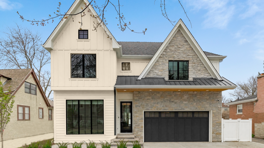
Charcoal and Natural Wood:
The trend of deep charcoal colours for your home’s exterior continues to gain momentum. Imagine blacks and dark grays but with earthy undertones, adding a touch of drama to your curb appeal.
This dark paint colour, especially when paired with natural wood trim, is particularly appealing and is expected to remain popular well into the next year. It’s a choice that resonates with both modern exteriors and revamped traditional homes alike.
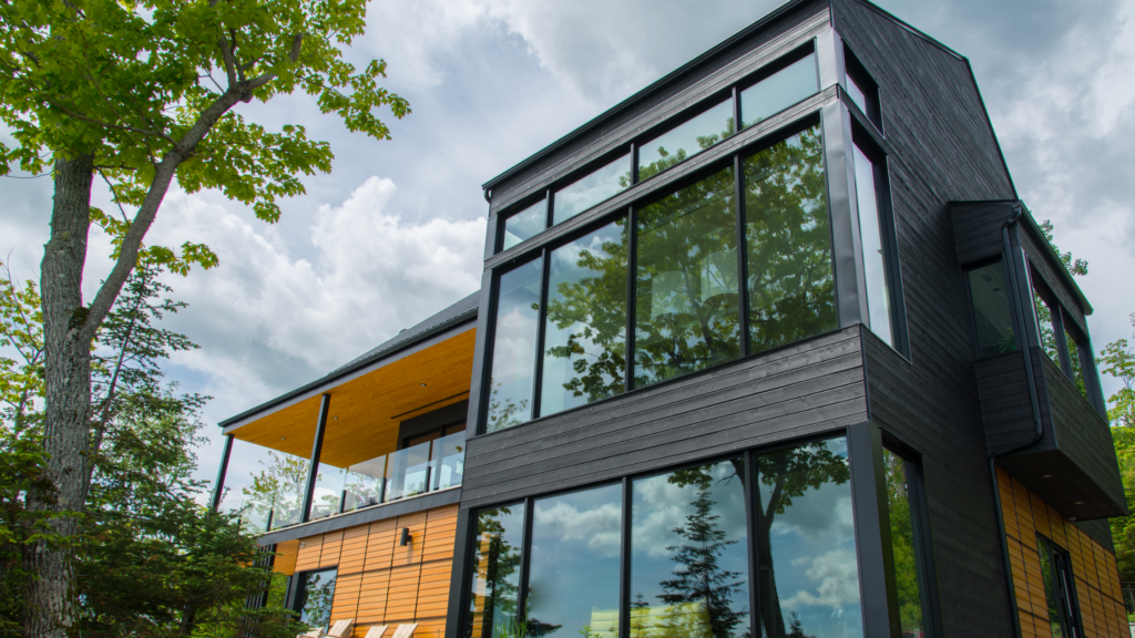
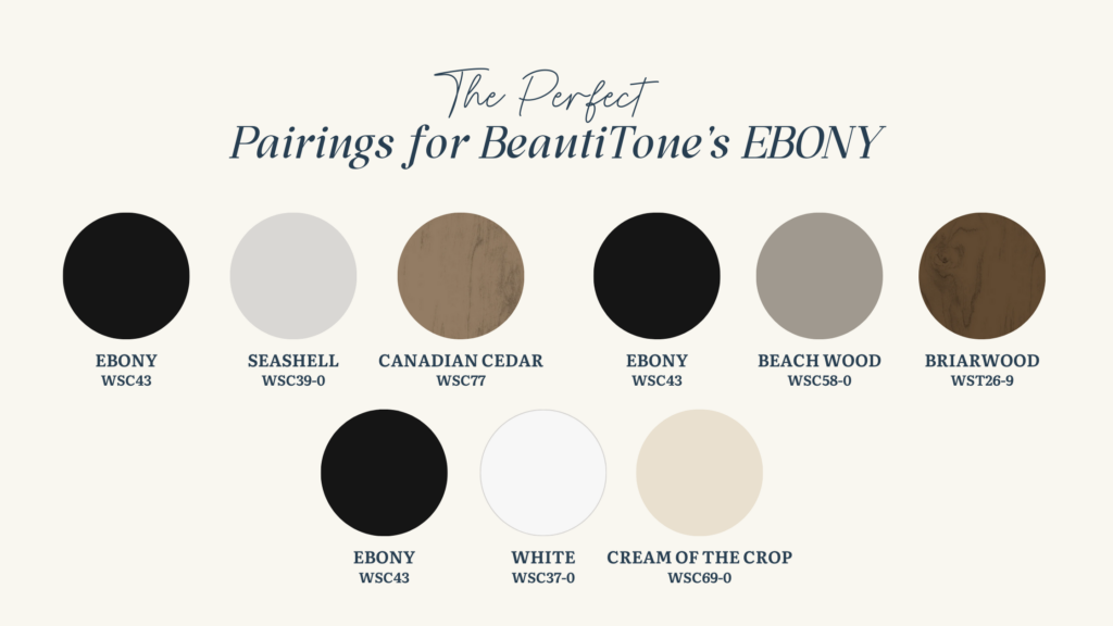
BeautiTone’s Ebony is a stunning charcoal hue that commands attention and pairs seamlessly with light and mid-tone woods for a captivating contrast. In my own observations, I’ve noticed this trend of ebony paired with natural wood accents emerging in new builds by the lake and nestled in the woods. But what sets Ebony apart is its timeless appeal.
When matched with the right style of home, it becomes a choice that effortlessly transforms your space into a modern and sophisticated masterpiece. Particularly if your home leans modern like this one, Ebony adds a sleek edge that never goes out of style.
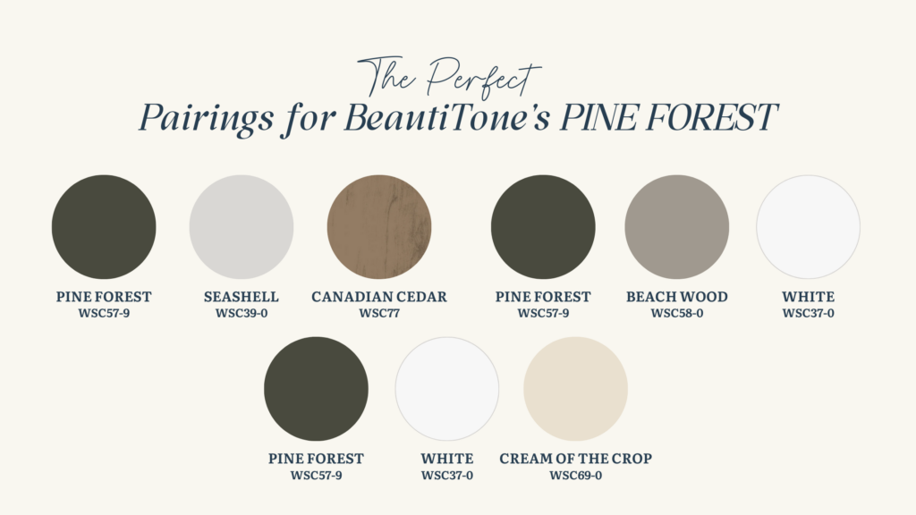
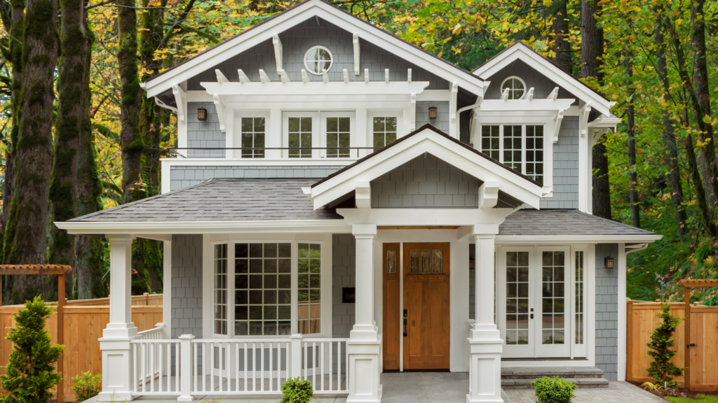
Timeless Dark Green:
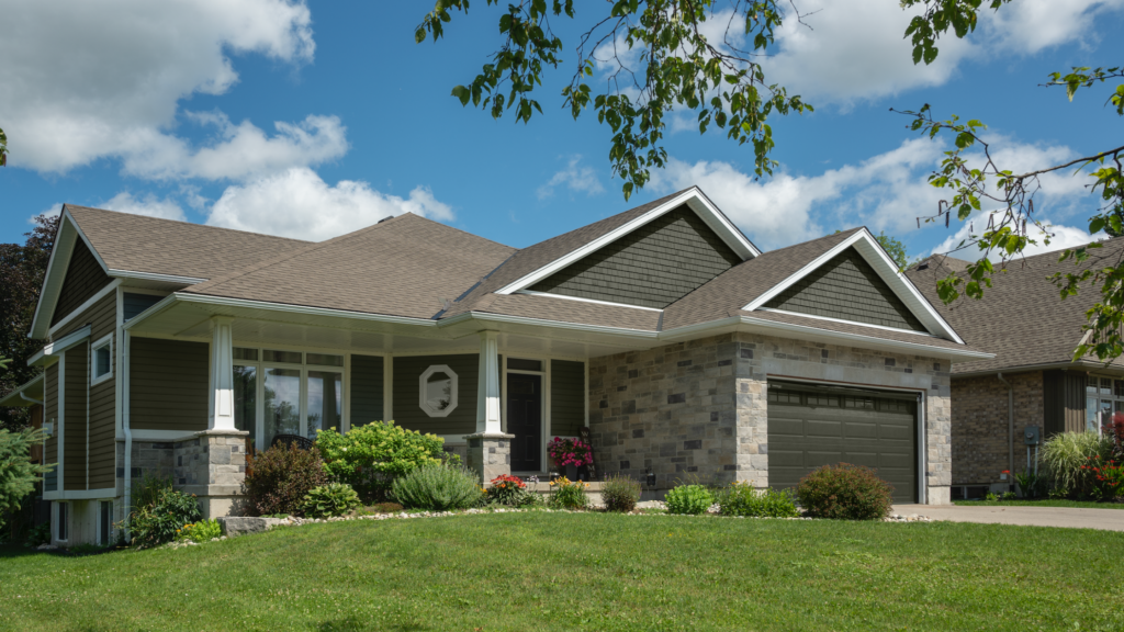
This next colour is one of my favourite for cottage country! It’s aptly called “Pine Forest”—a rich, deep green that’s incredibly versatile and totally captivating. I find it to be the perfect backdrop for any type of home, whether you’re going for that classic Craftsman look, embracing Colonial elegance, or the more relaxed Ranch style house. And it’s especially eye-catching with lots of warm white trim!
Pine Forest doesn’t blend in; in fact, it stands out in all the right ways. It’s the kind of colour that adds character and warmth to your space, giving it that cozy, nature-inspired vibe we all love. And it’s extremely versatile—it pairs beautifully with cedar or stone accents, adding a touch of rustic charm to your home. Think cottage country vibes, especially when you’re nestled in the woods or surrounded by other homes featuring those earthy tones. Pine Forest is a timeless classic, just like the beauty of nature itself.
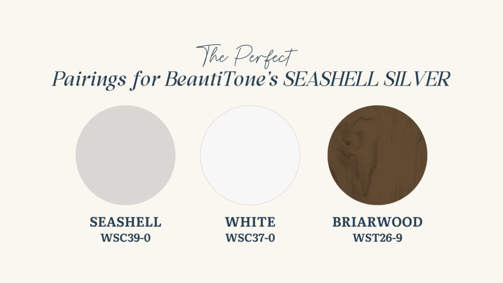
Versatile Silver-Gray
Let’s talk about Seashell Silver—a beautiful light neutral that’s still holding strong in the mainstream. It’s a silver-gray tone that’s incredibly versatile, making it a perfect match for various styles and materials like stone, brick, and wood. In fact, we’re seriously considering this colour for our new home build on the lake, and for good reason—it’s timeless.
Seashell Silver looks especially stunning with plenty of white, substantial trim, and white windows, creating a classic and elegant look. And the best part? It’s a colour that transcends trends, looking equally fantastic on both modern and traditional homes. With its enduring appeal, Seashell Silver is a choice that will never go out of style
Expert Advice: Choosing Your Ideal Exterior Colour
In conclusion, choosing the right exterior paint colour for your home is a decision not to be taken lightly. After all, it’s a choice that will impact the look and feel of your home for years to come. Whether you’re drawn to timeless classics like Pine Forest and Seashell Silver or leaning towards bold statements with colours like Ebony and Pacific, there’s a perfect shade out there waiting for you.
Remember, I’m here to help guide you through this process, ensuring that you find the ideal colour that reflects your personal style and enhances your home’s curb appeal. Don’t hesitate to reach out for assistance, and be sure to check out my paint colour packages for expert guidance. Additionally, explore my blog full of valuable tips on testing exterior paint colours.
Together, let’s transform your home into the masterpiece you’ve always envisioned!
For more inspiration, be sure to check out my Pinterest board featuring the colours I’m loving for exteriors in 2024.
Stay Inspired,
Rose


Great article! I really appreciate the clear and detailed insights you’ve provided on this topic. It’s always refreshing to read content that breaks things down so well, making it easy for readers to grasp even complex ideas. I also found the practical tips you’ve shared to be very helpful. Looking forward to more informative posts like this! Keep up the good work! YouTube Downloader Online
I’m so glad to hear that this was helpful! I really try to teach my clients the importance of taking time to make such a big decision like the exterior colour of their home and to emphasize that you must test colours and compare them. It is worth taking your time to get the perfect paint colour! And there are soooo many beautiful, timeless, striking colours to choose from these days.